Transport Victoria in the style of Mexico City's Integrated Mobility (MI - Mobilidad Integrada)
It’s best seen in a horizontal screen; rotate your phone or view it in a computer.
Introduction
Designed in 1968 by Lance Wyman, the Mexico City Metro’s visual identity has become inseparable from the city itself. The system was conceived with inclusivity in mind, making navigation intuitive for everyone, including non-Spanish speakers and those with limited literacy. That same year, Wyman brought a parallel vision to the 1968 Olympic Games, developing a cohesive graphic identity that guided visitors through venues using bold, universal wayfinding.
Drawing from pre-Hispanic traditions, Wyman and his team wove together contemporary design and ancient symbolism to craft a visual language all its own, pairing each station with a distinctive icon and name that reflects the cultural and historical depth of the city.
Movilidad Integrada (Integrated Mobility)

In 2019, the government of Mexico City created the “Sistema de Movilidad Integrada de la Ciudad de Mexico (MI)” - Mexico City’s Integrated Mobility System to integrate (almost) all systems of public transport within the City and Metropolitan Area in a single unified entity. To further improve this unification, a single payment system was introduced at the same time: the Tarjeta de Movilidad Integrada
This new integrated system was created to merge the operation of the different public transport systems:
- Metro
- Metrobus (BRT)
- El Insurgente (Commuter Train)
- Cablebus (aerial lift)
- Light Rail
- Trolleybus
- Ecobici (Public Bike Sharing)
- RTP and Concesionados (Public buses)
Giving Transport Victoria a new visual identity
What if Transport Victoria had the same identity as Mexico City’s Movilidad Integrada?
DISCLAIMER: I am not a graphic designer and I know I’ve done mistakes. Please be gentle.

Th original MI mosaic and logo includes the colours of 8 different transport systems. However, in Melbourne I could only find 8 systems integrated in Transport Victoria, that’s why Metro is included twice on the top and bottom of the mosaic.
This design experiment was done following inspiration from PTV/Transport Victoria brand guidelines and Movilidad Integrada brand guidelines, merging both into one graphical identity.
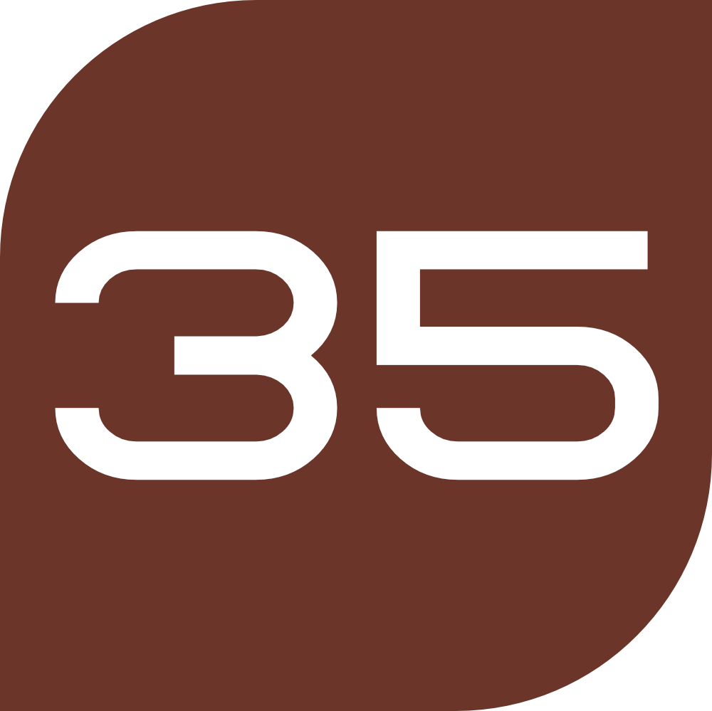
Metro
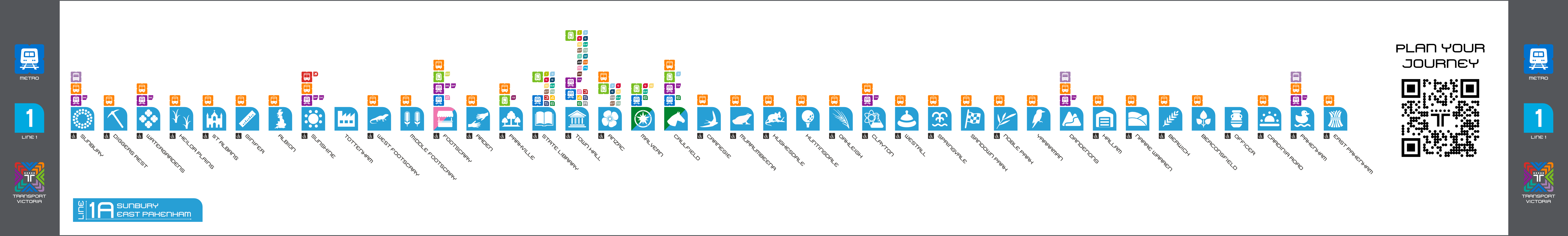
 In order to keep it simple, I gave each tran line a new number (and a letter for each separate service). Numbering was done in no particular order.
Line 1: Metro Tunnel (Cranbourne, Pakenham, and Sunbury lines)

View the pictograms used for this line, along with each description by clicking here
Services
Line 1A: Sunbury - East Pakenham
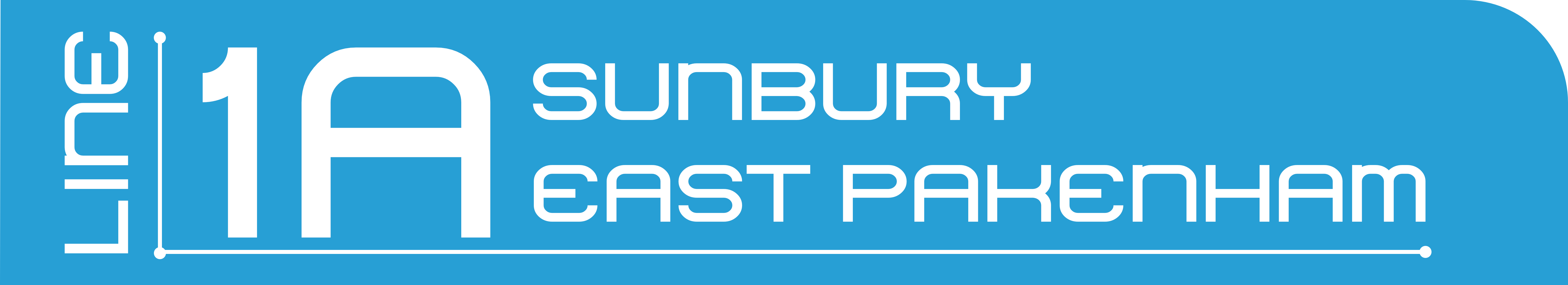 Diagram of the line

Diagram including connections to other services
Line 1B: Sunbury - Cranbourne
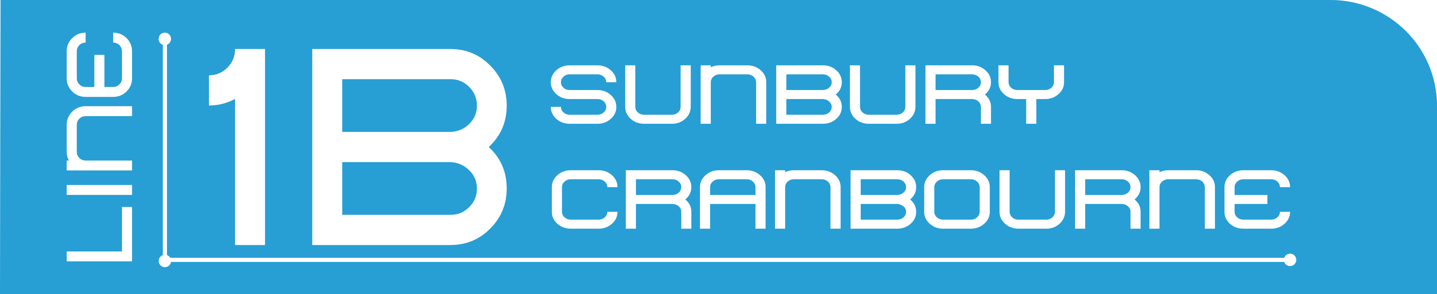 Diagram of the line
Diagram including connections to other services
Line 2: Sandringham, Werribee, and Williamstown lines

View the pictograms used for this line, along with each description by clicking here
Services
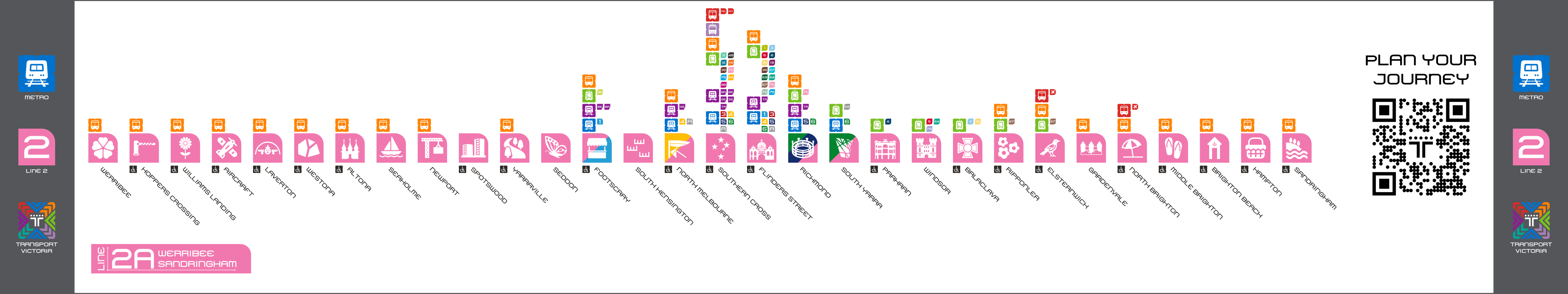
Line 2A: Werribee - Sandringham
 Diagram of the line
Diagram including connections to other services
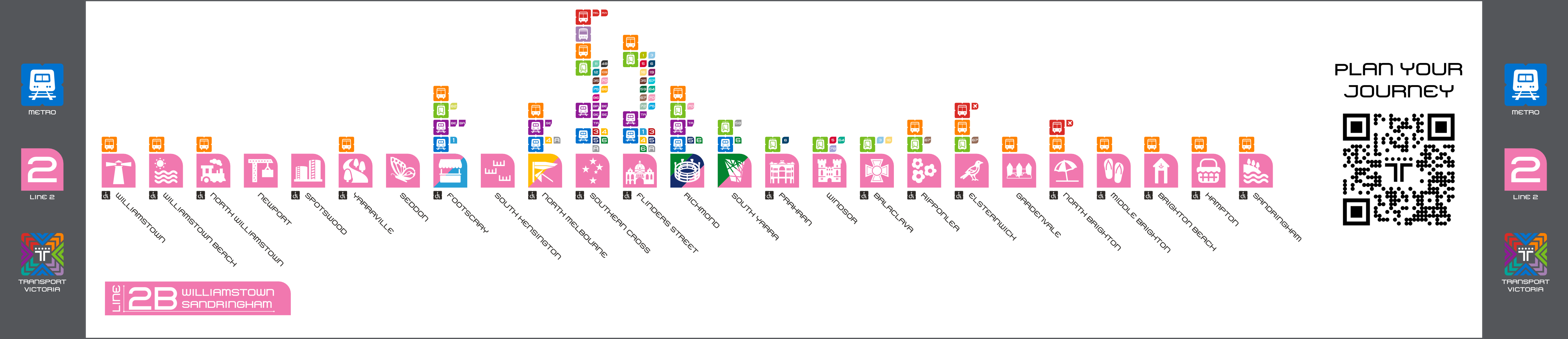
Line 2B: Williamstown - Sandringham
 Diagram of the line
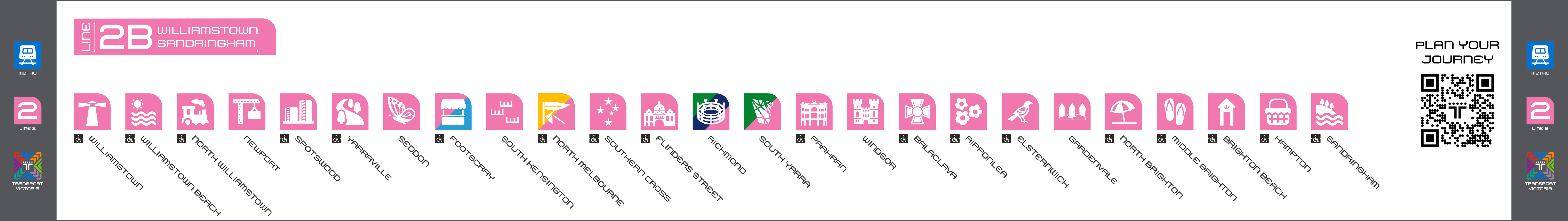
Diagram including connections to other services
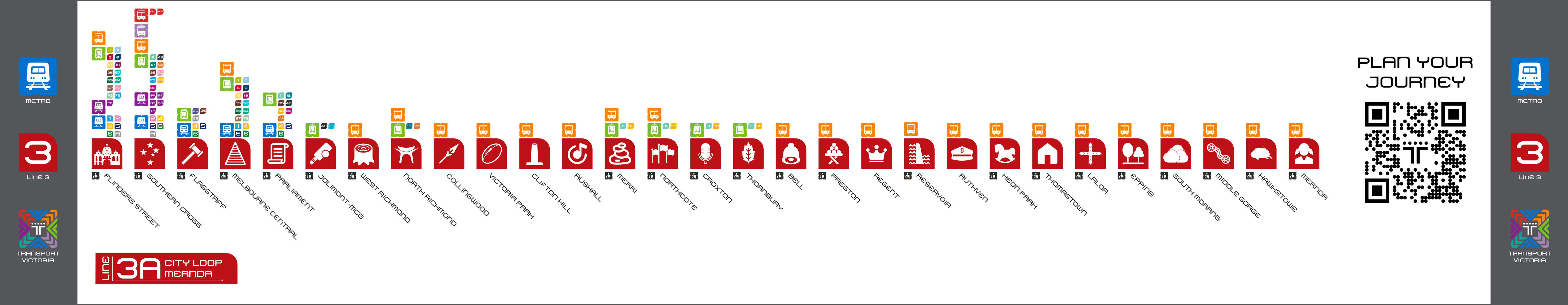
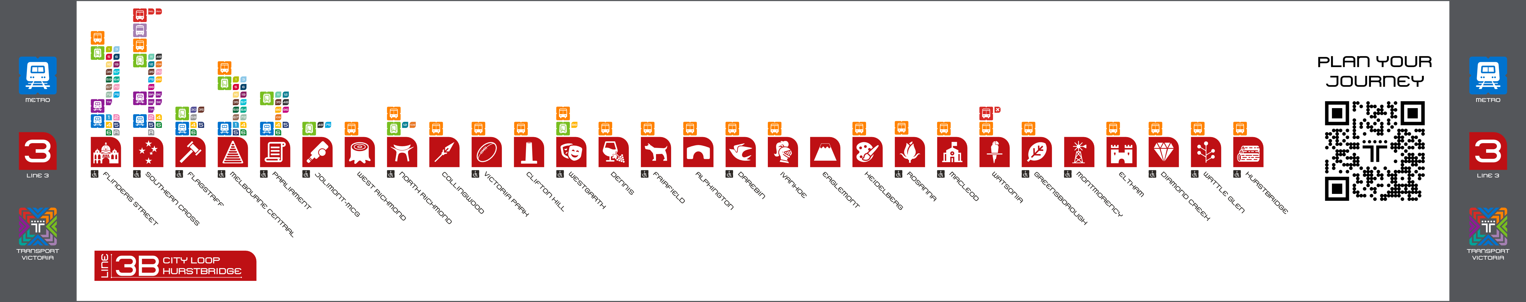
Line 3: Hurstbridge and Mernda lines

View the pictograms used for this line, along with each description by clicking here
Services
Line 3A: City Loop - Mernda
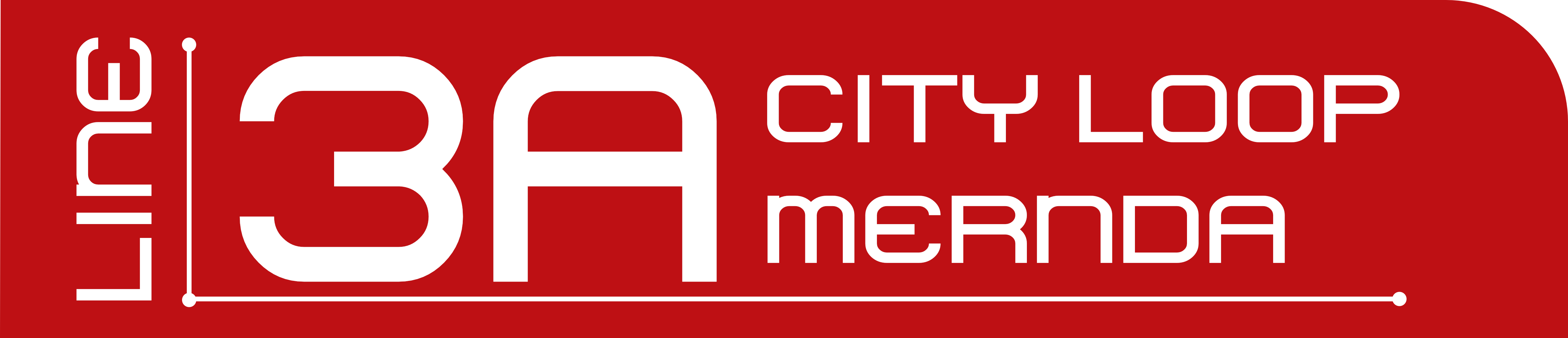
Diagram of the line
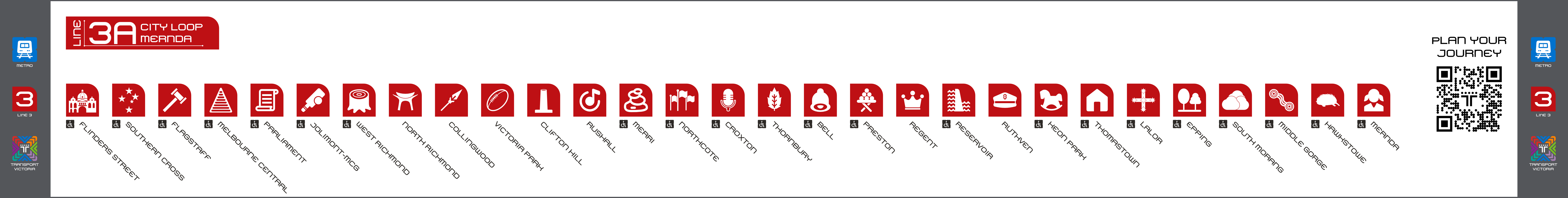
Diagram including connections to other services
Line 3B: City Loop - Hurstbridge
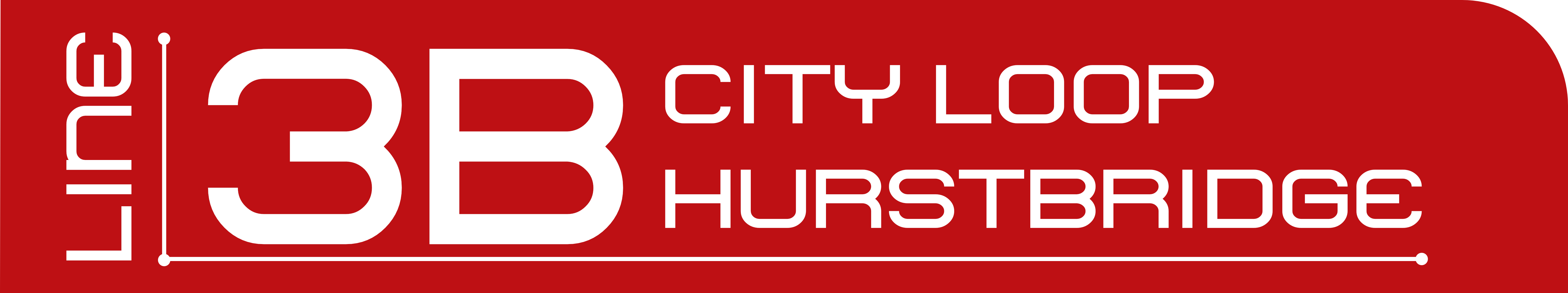
Diagram of the line
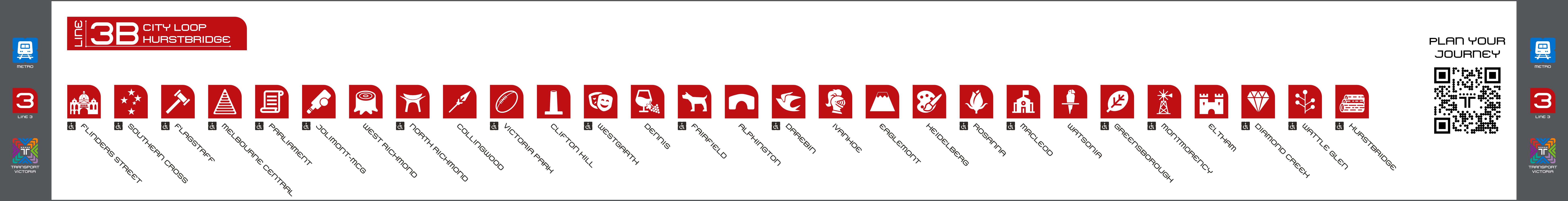
Diagram including connections to other services
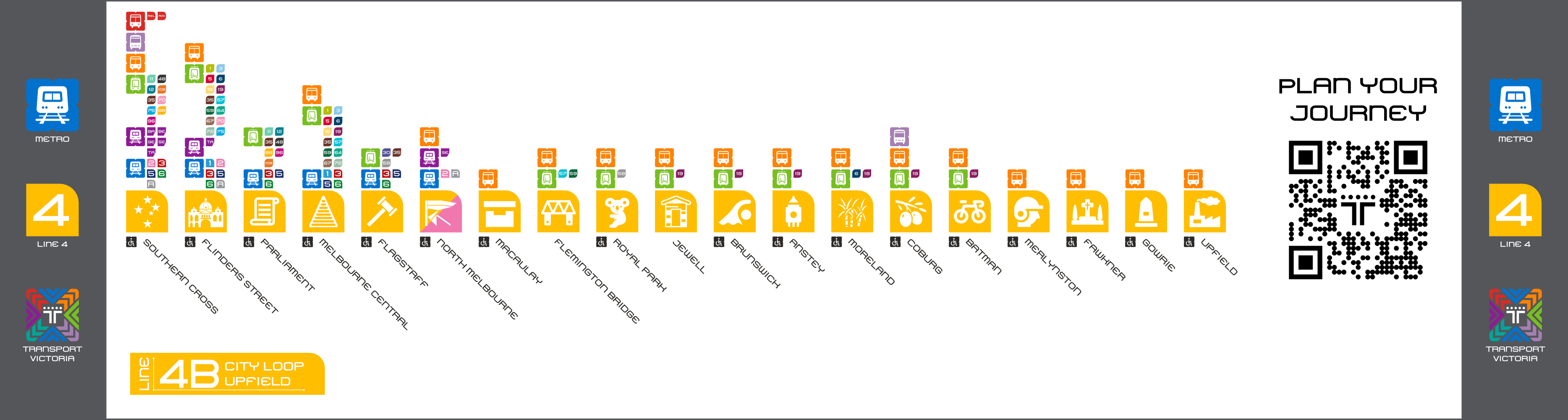
Line 4: Craigieburn and Upfield lines
View the pictograms used for this line, along with each description by clicking here
Services
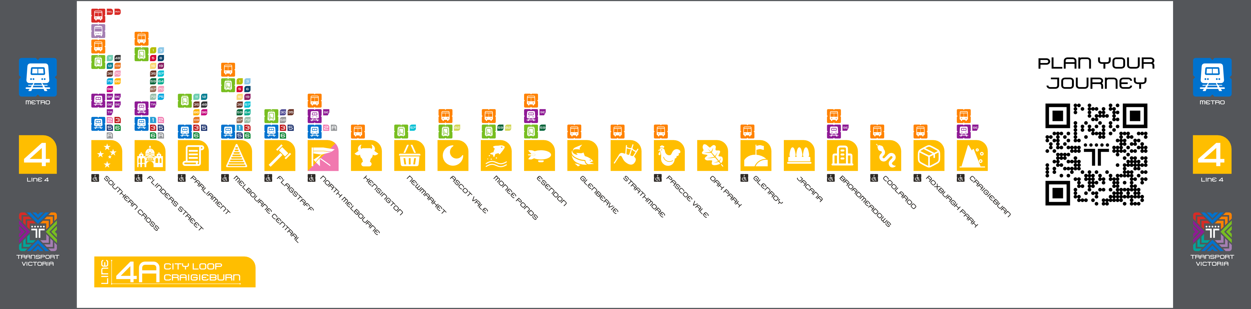
Line 4A: City Loop - Craigieburn
Diagram of the line
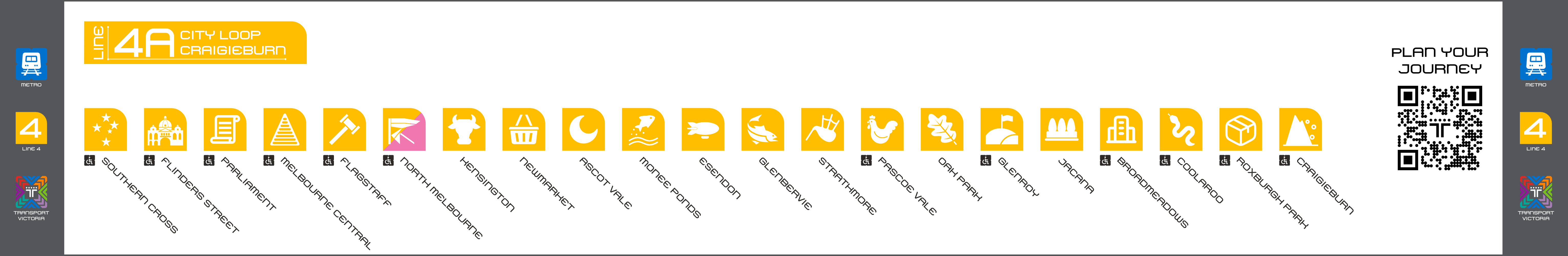
Diagram including connections to other services
Line 4B: City Loop - Upfield
Diagram of the line
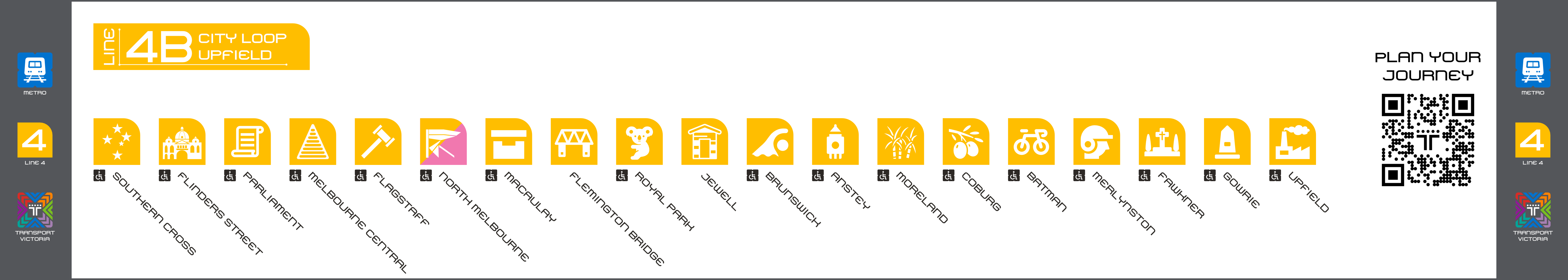
Diagram including connections to other services
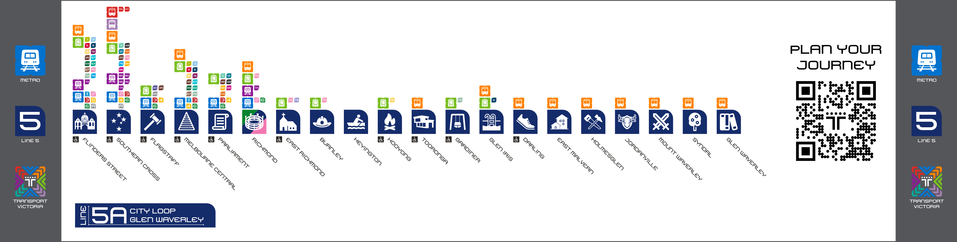
Line 5: Alamein, Belgrave, Glen Waverley, and Lilydale lines

View the pictograms used for this line, along with each description by clicking here
Services
Line 5A: City Loop - Glen Waverley
Diagram of the line
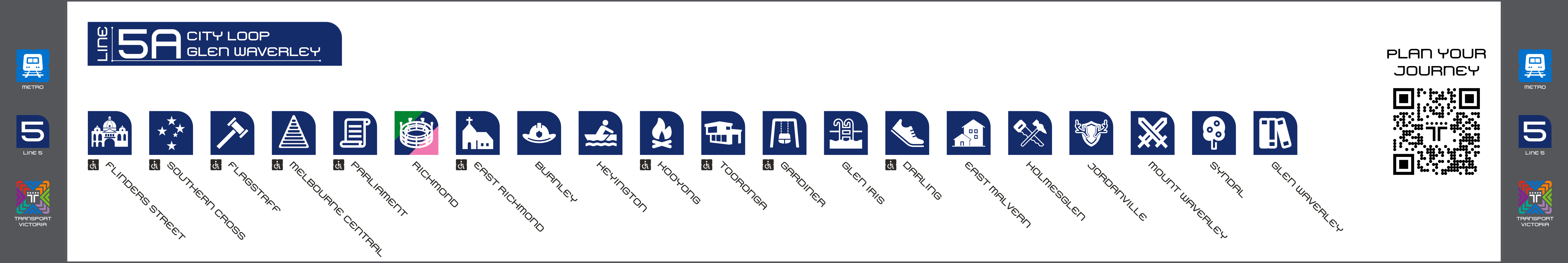
Diagram including connections to other services
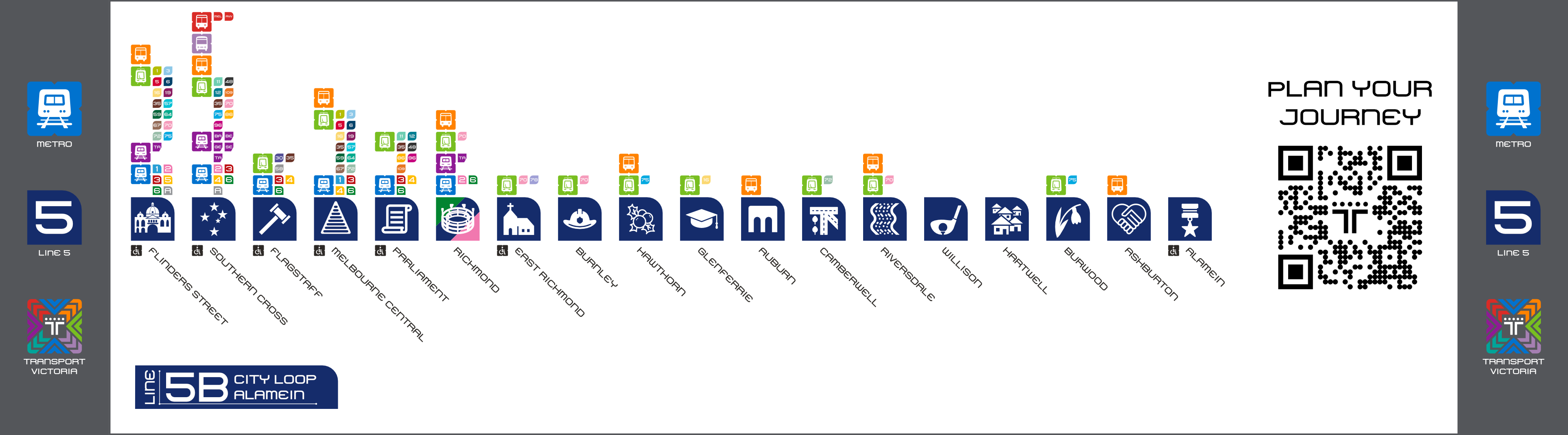
Line 5B: City Loop - Alamein
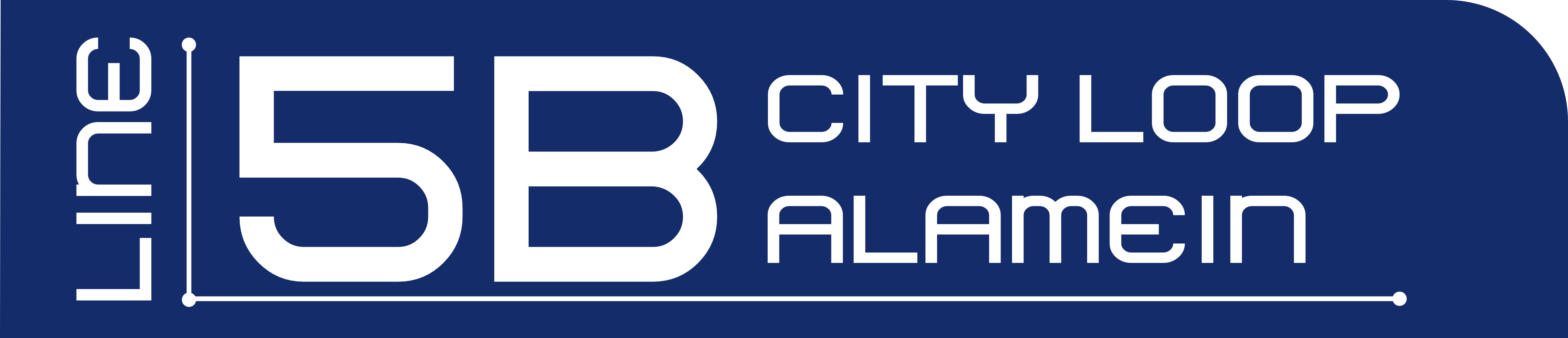
Diagram of the line
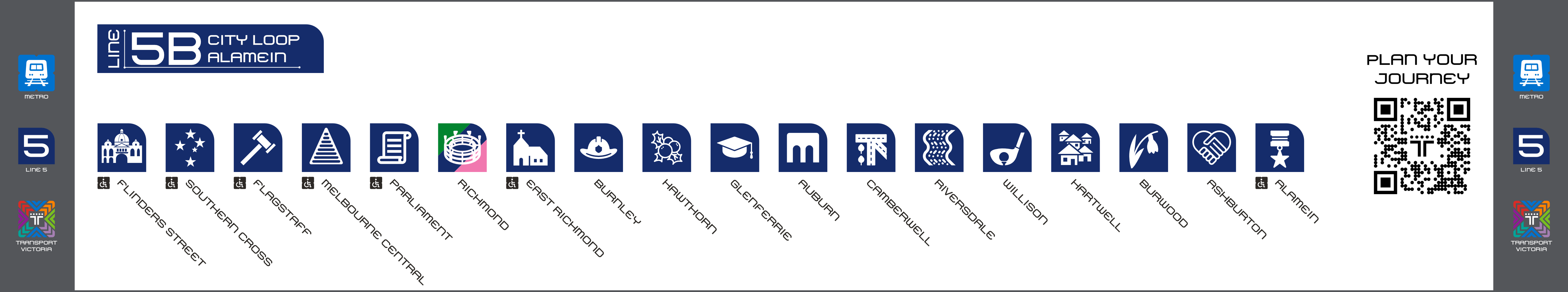
Diagram including connections to other services
Line 5C: City Loop - Lilydale
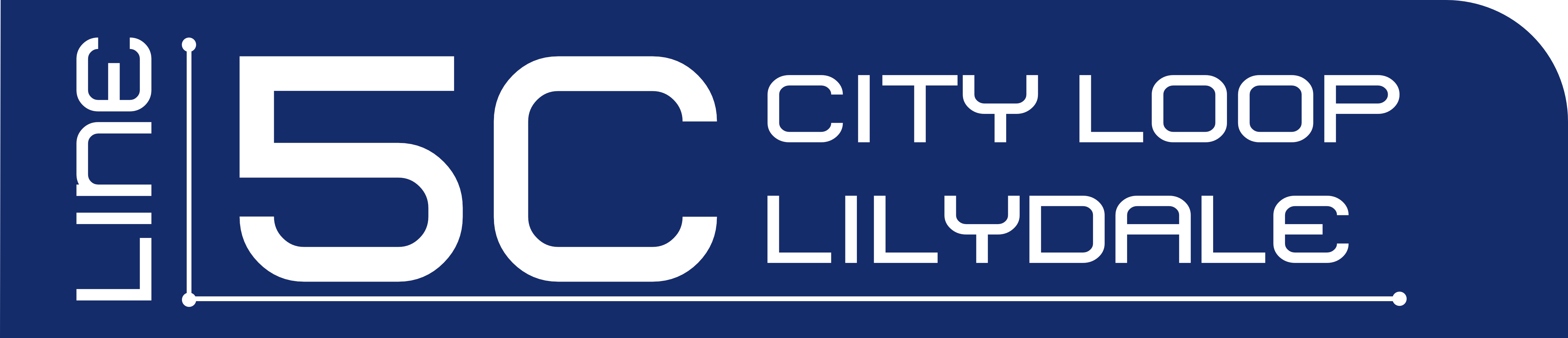
Diagram of the line
Diagram including connections to other services
Line 5D: City Loop - Belgrave
Diagram of the line
Diagram including connections to other services
Line 6: Frankston line

View the pictograms used for this line, along with each description by clicking here
Services
Line 6: City Loop - Frankston
Diagram of the line
Diagram including connections to other services
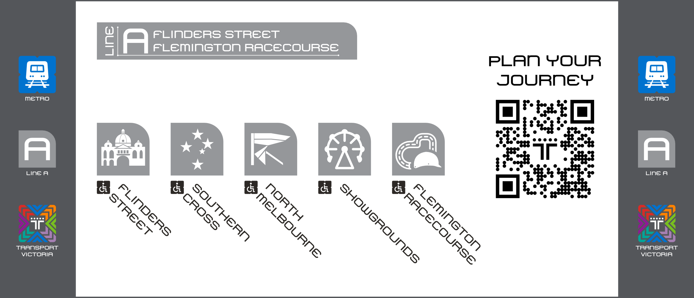
Line A: Flemington Racecourse line
This line uses the letter A instead of a number since it is not a regular service, only used for special events.

View the pictograms used for this line, along with each description by clicking here
Services
Line A: Flinders Street - Flemington Racecourse
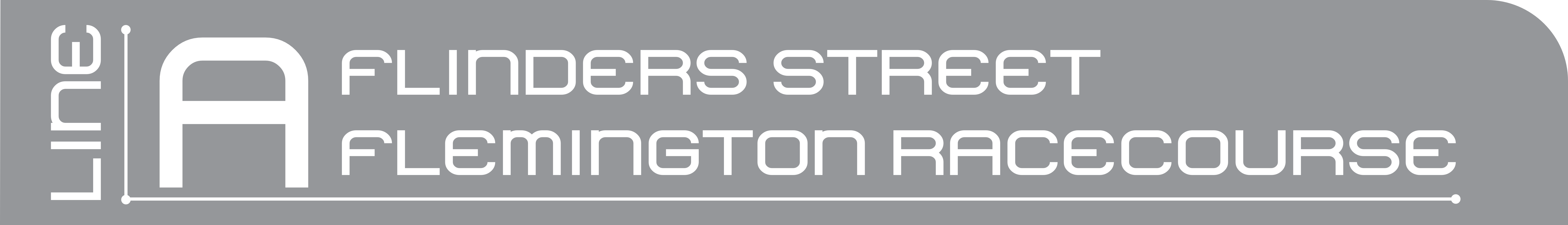
Diagram of the line
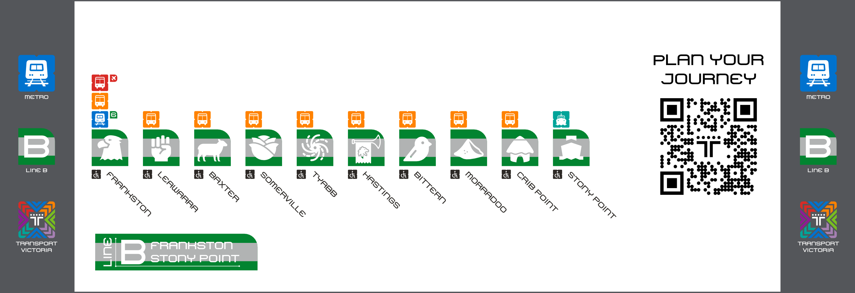
Line B: Stony Point line
This line uses the letter B instead of a number, since it is not a regular Metro service.

View the pictograms used for this line, along with each description by clicking here
Services
Line B: Frankston - Stony Point
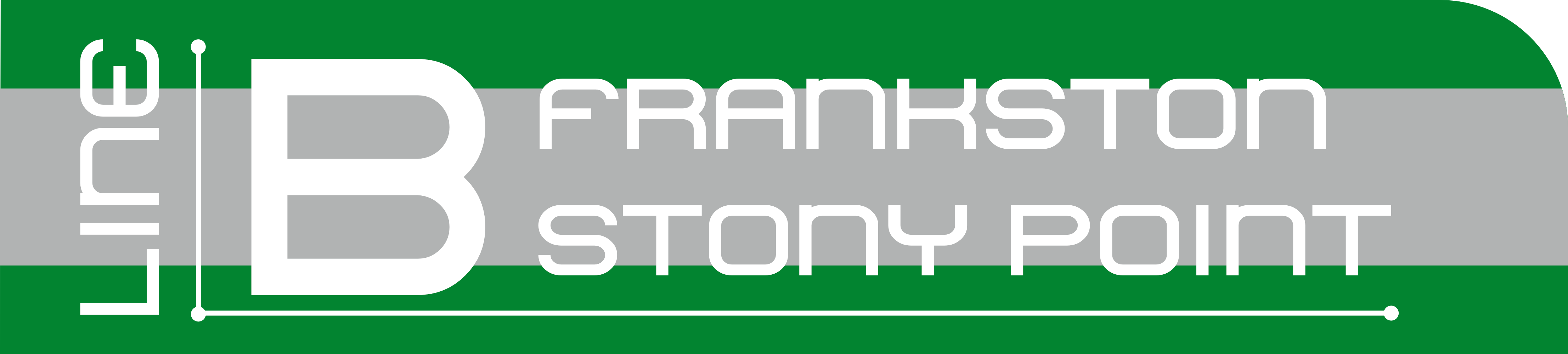
Diagram of the line
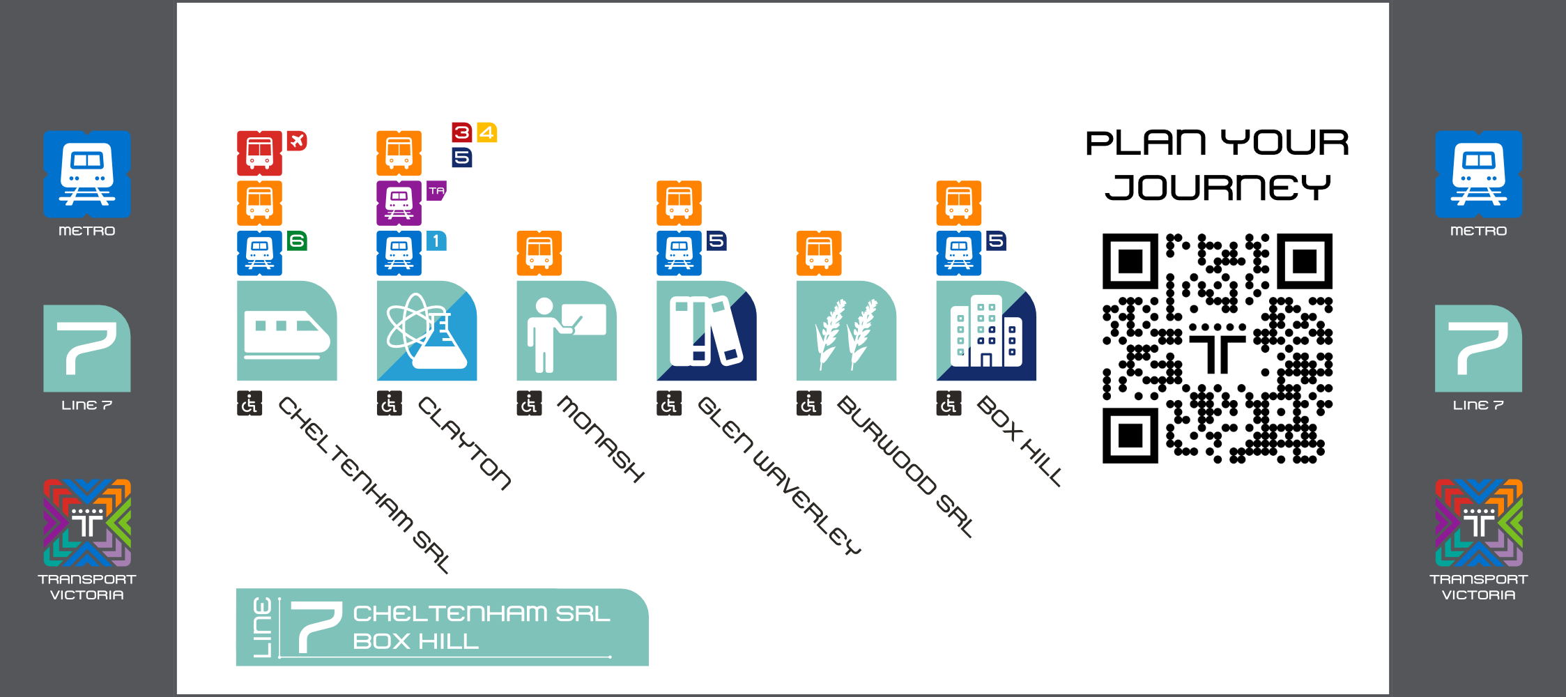
Line 7: Suburban Rail Line
Since this line is still in construction, I took more liberties to give each station a graphic identity.

View the pictograms used for this line, along with each description by clicking here
Services
SRL East: Cheltenham SRL - Box Hill
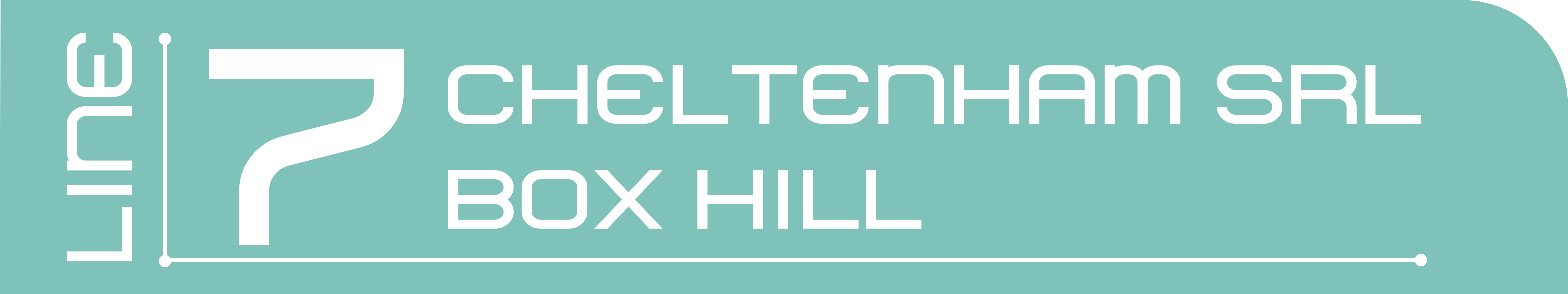
Diagram of the line
Suburban Rail Line: Cheltenham SRL - Werribee
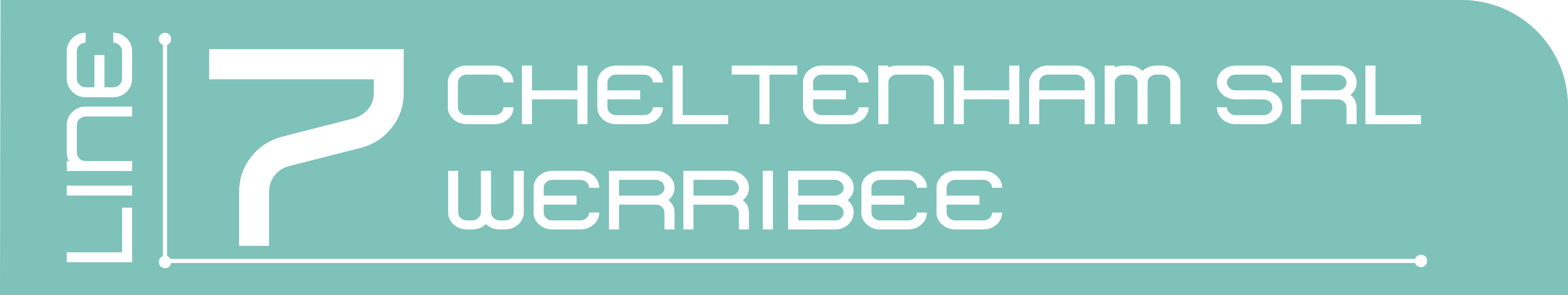
Diagram of the line
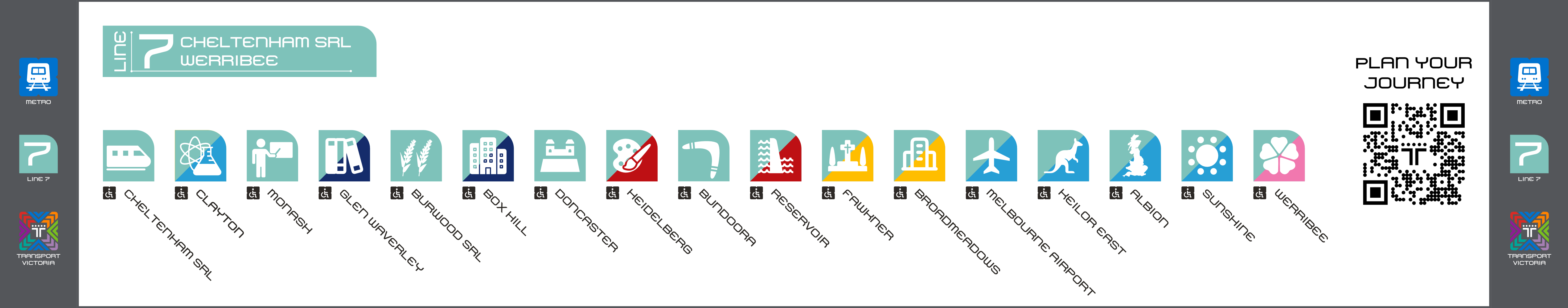
Diagram including connections to other services
Line 1 + Airport Link
Still in construction, this is the proposed route that trains will follow.
View the pictograms used for this line, along with each description by clicking here
Services
Line 1C: Airport - Cranbourne
Diagram of the line
Diagram including connections to other services
Line 1D: Airport - East Pakenham
Diagram of the line
Diagram including connections to other services
 ß
ß
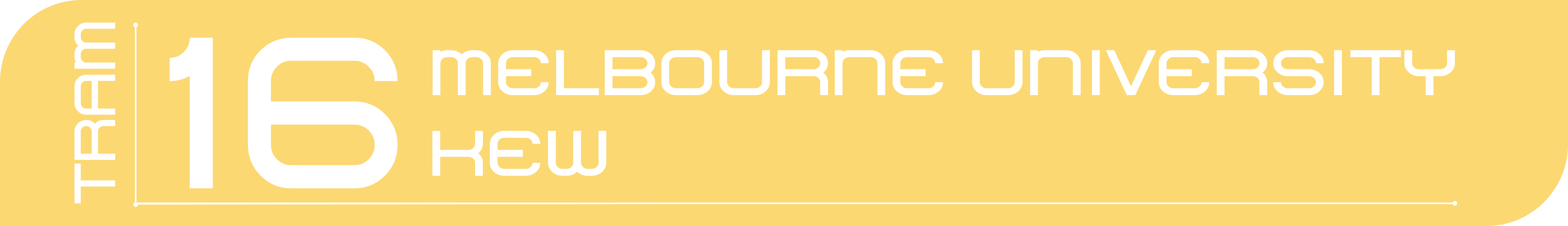
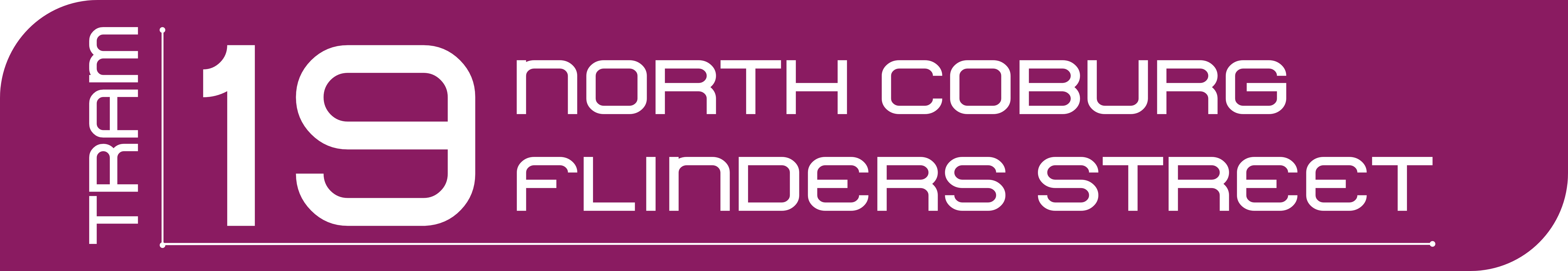
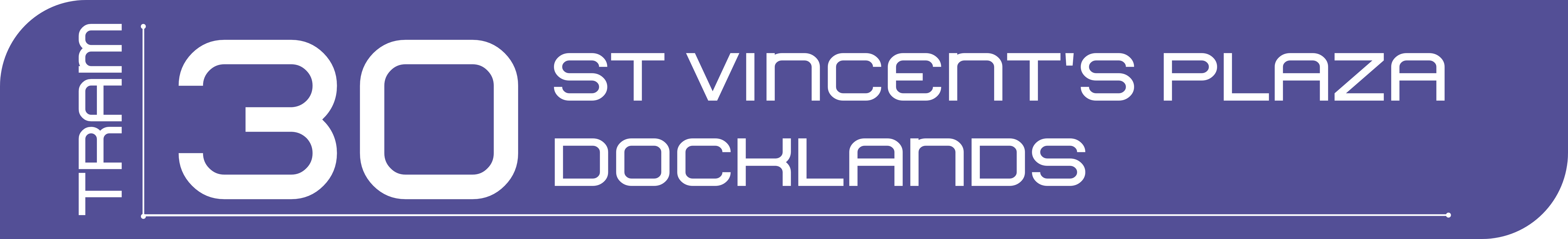
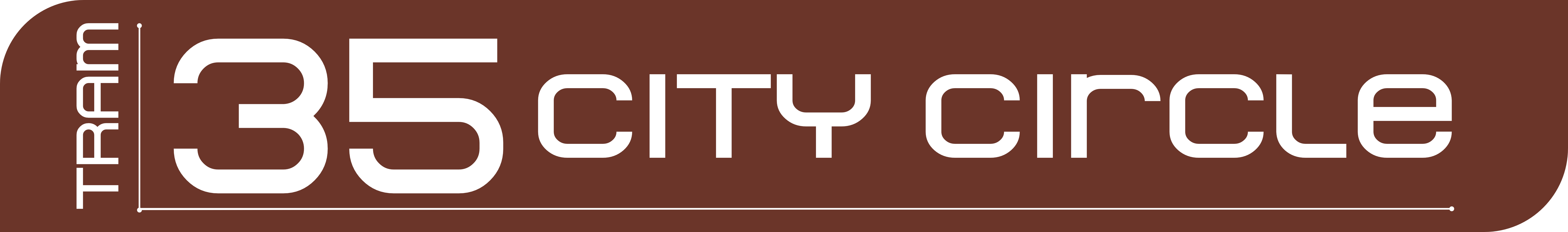
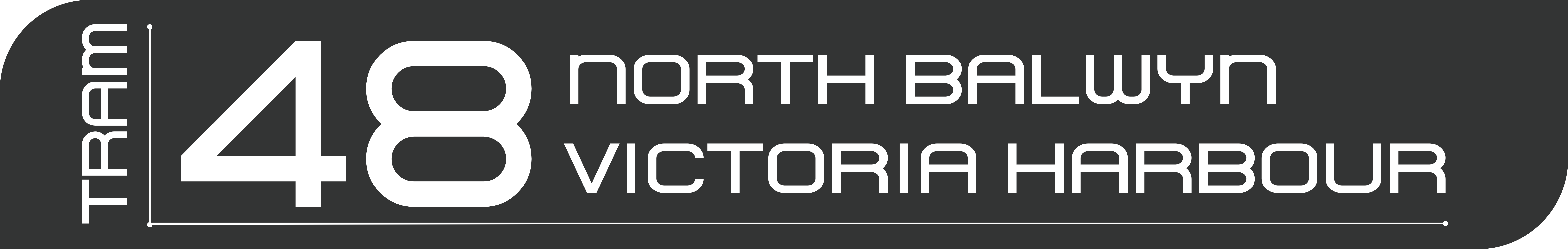
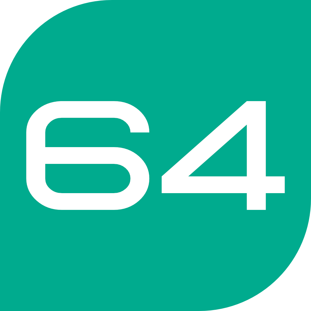
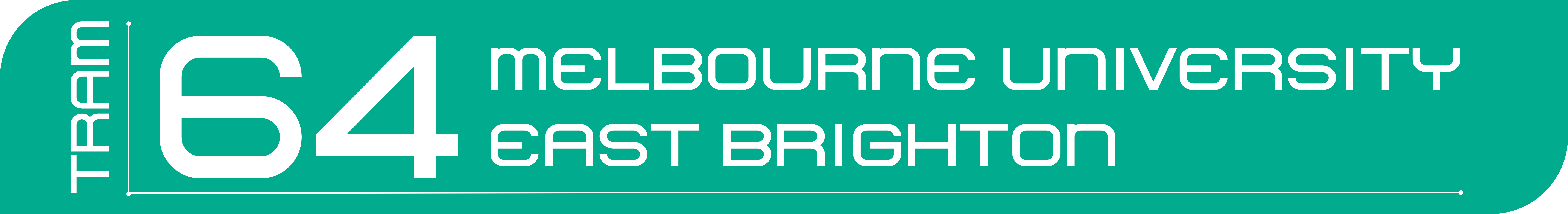
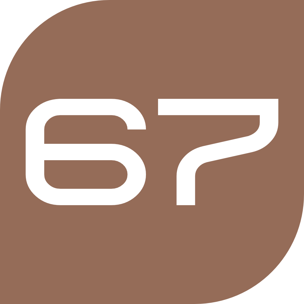
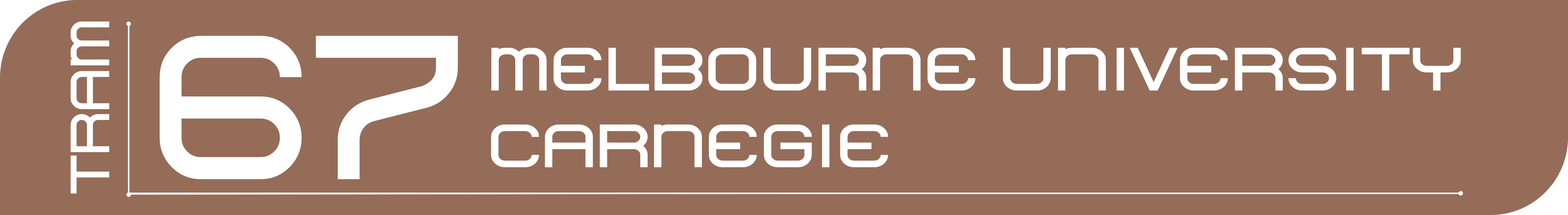
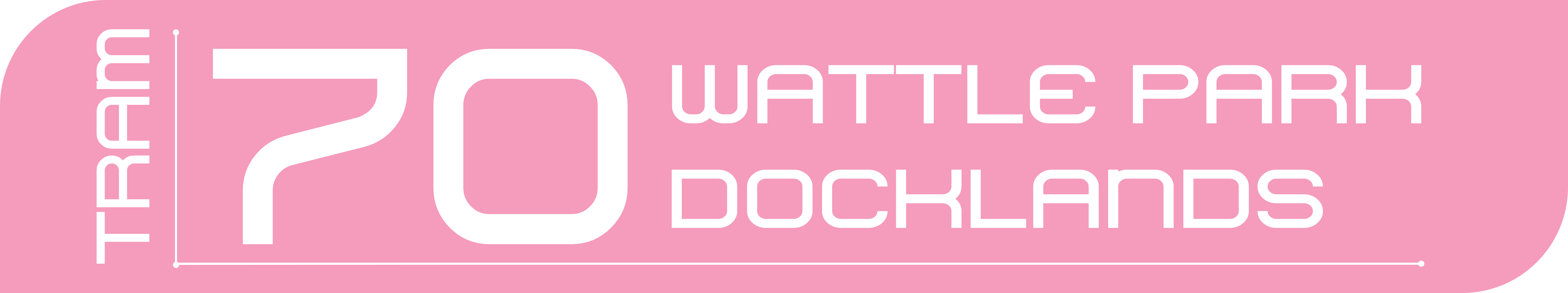
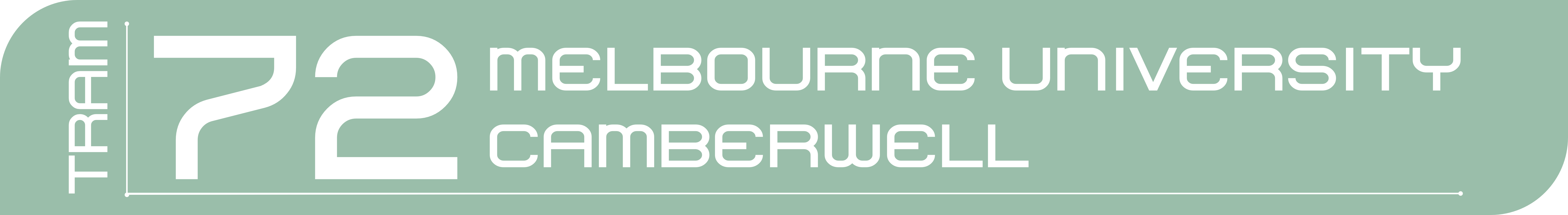
Trams
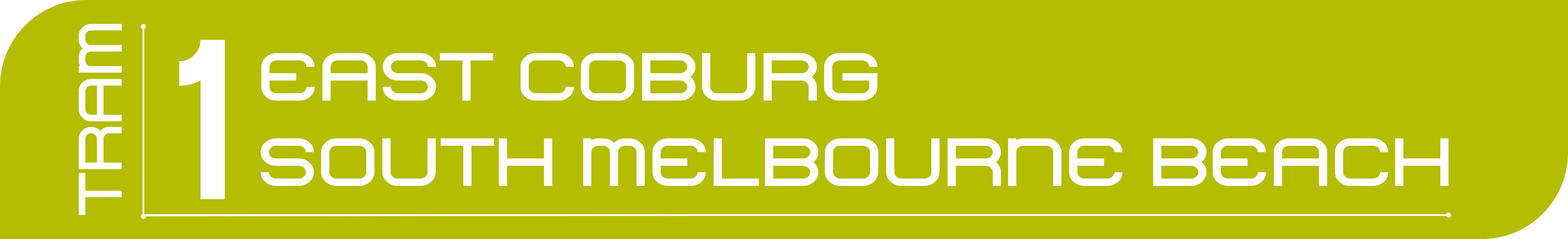
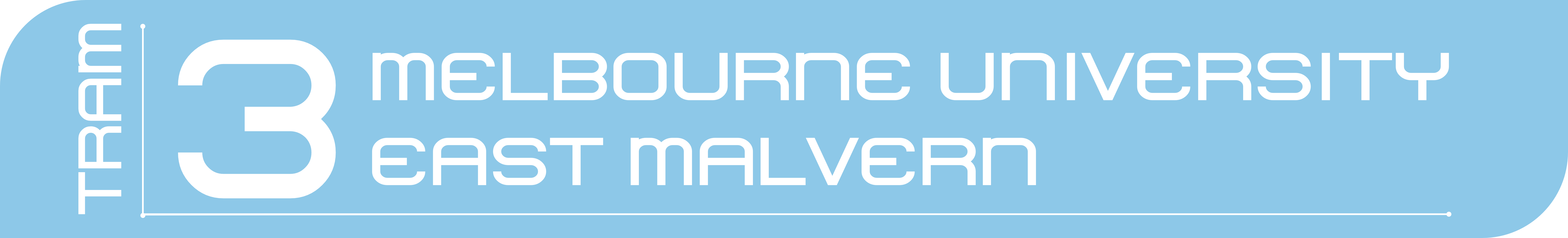
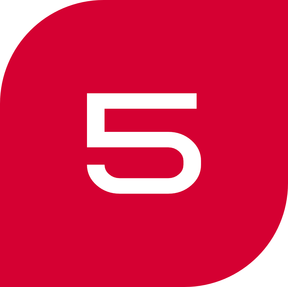
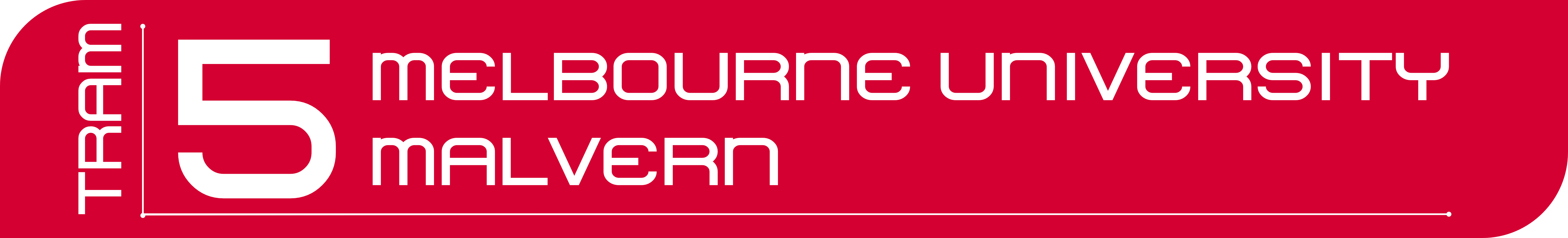
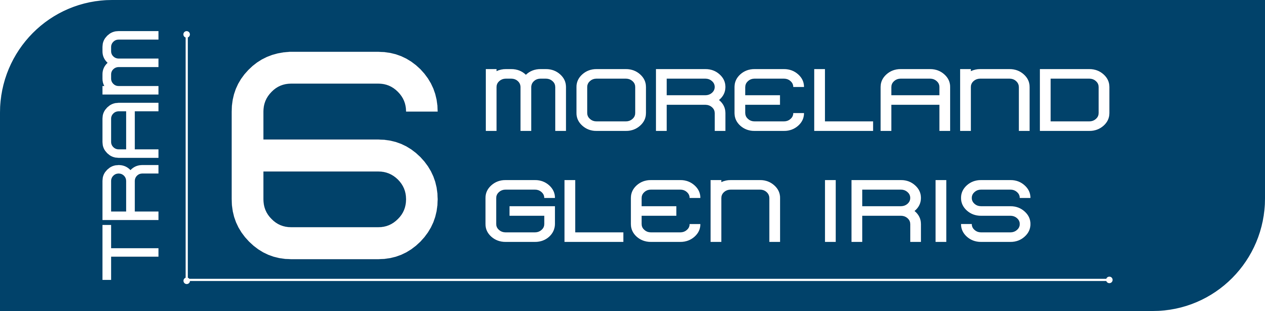
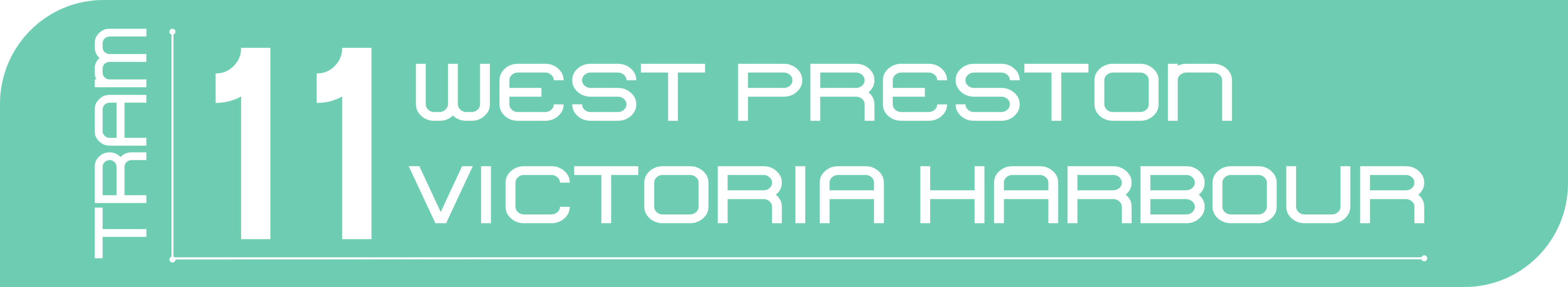
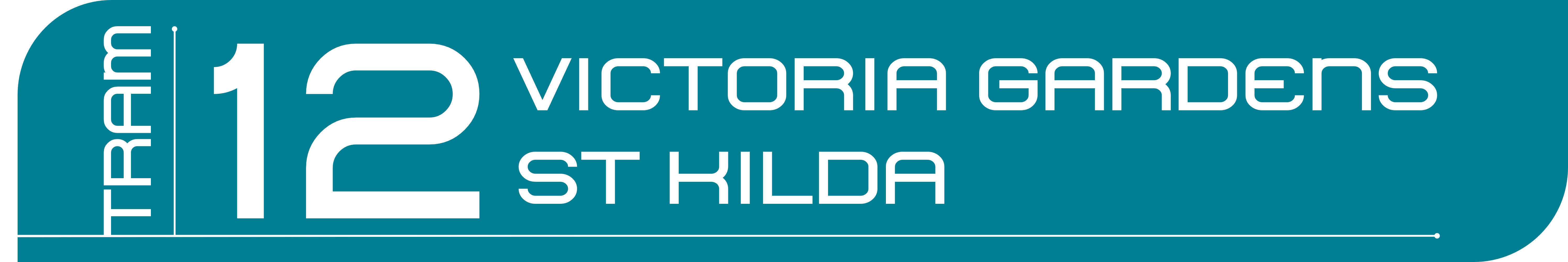
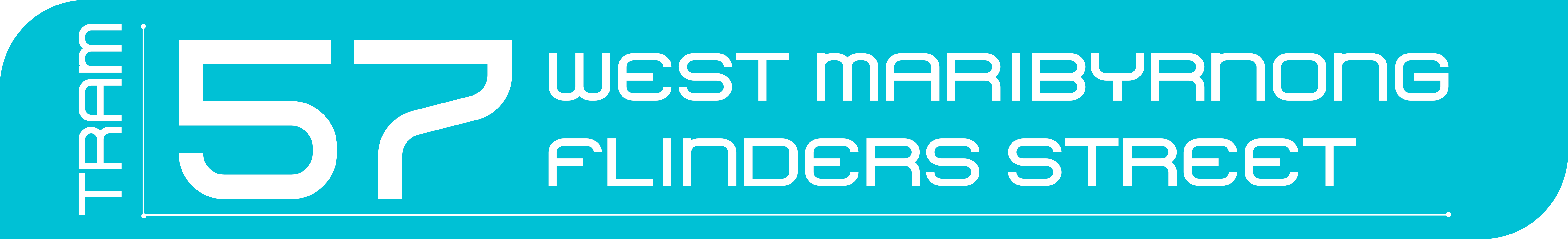
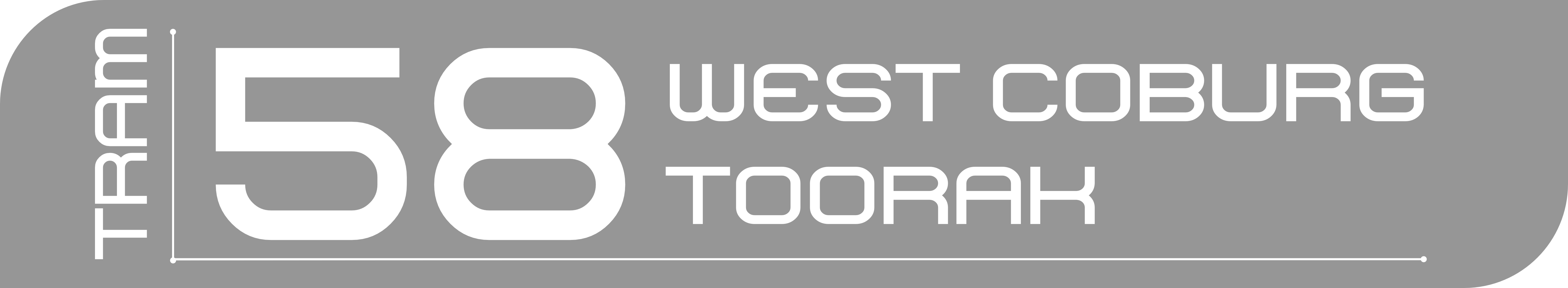
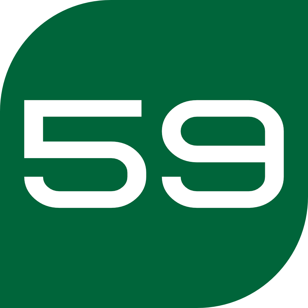
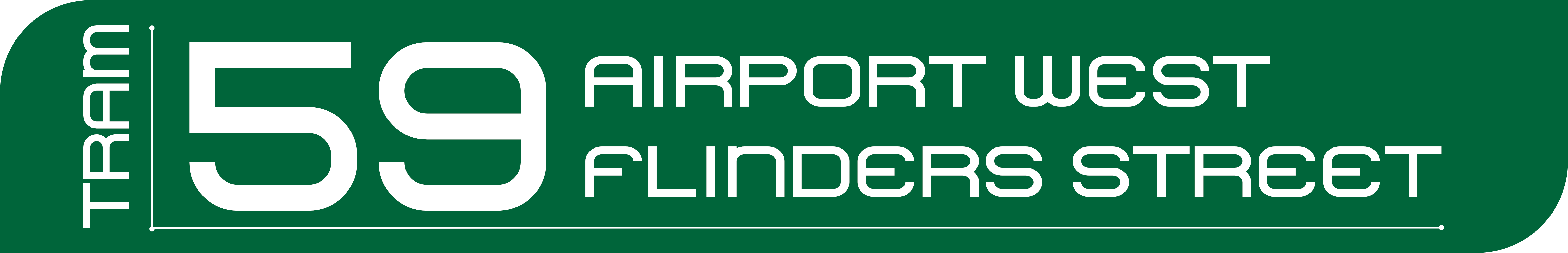
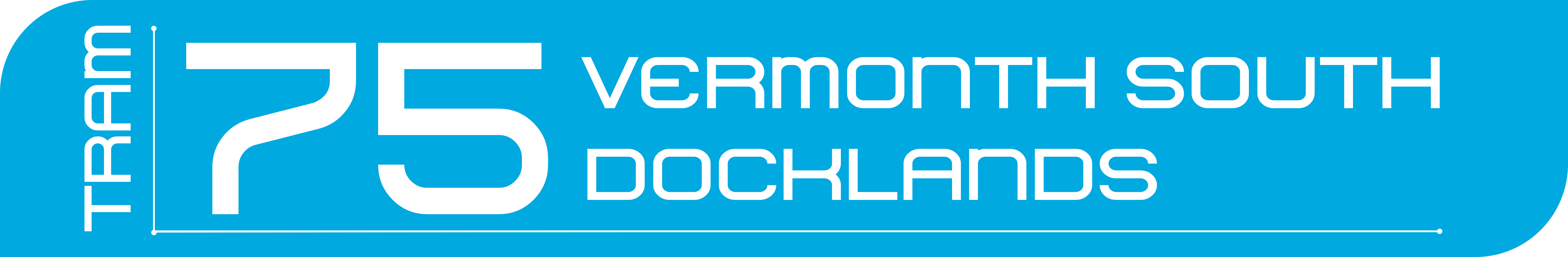
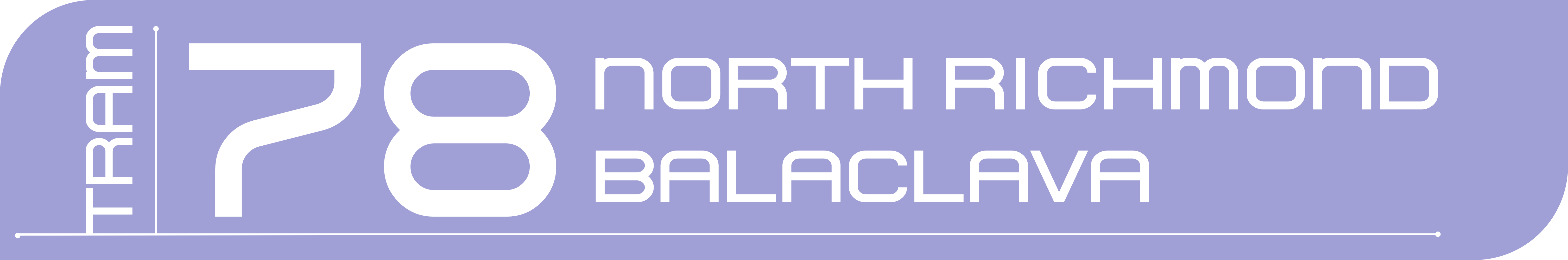
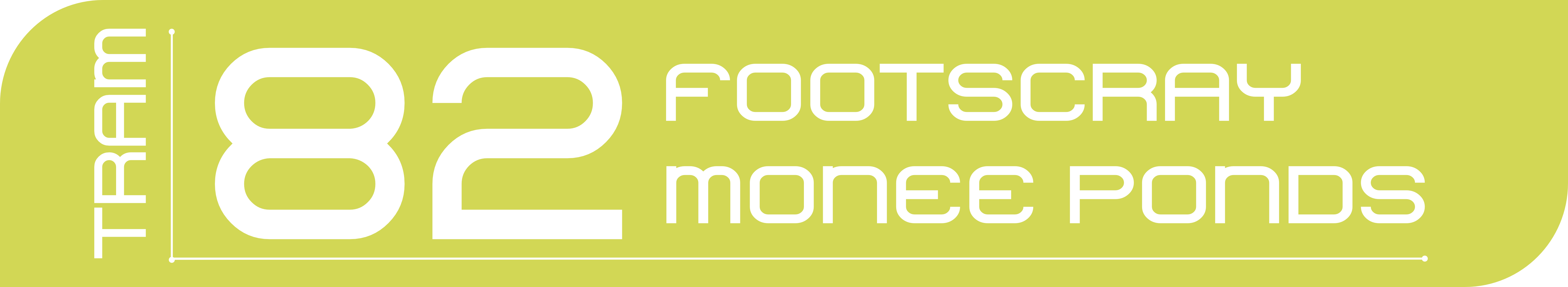
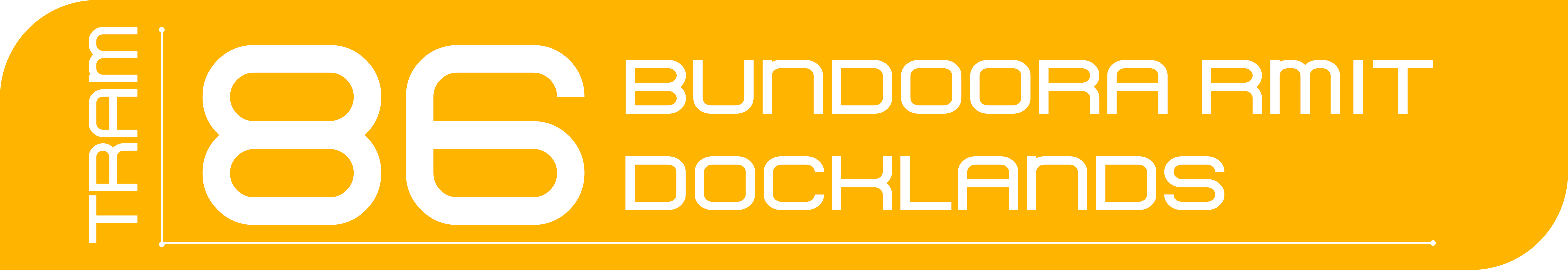
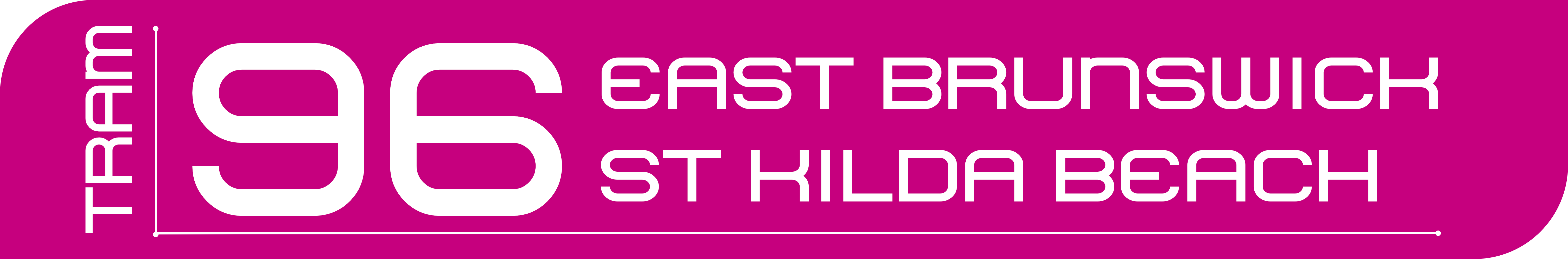
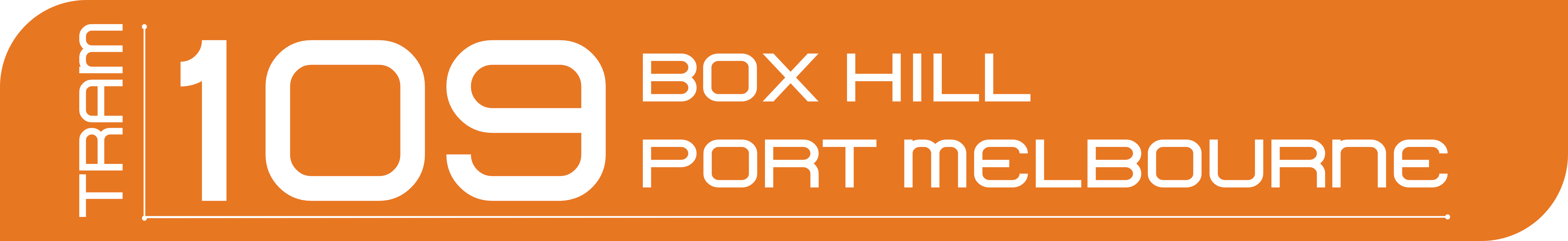
Tram signs for each line were done taking inspiration from the Yarra Trams logo, and making them fit MI’s design guidelines.
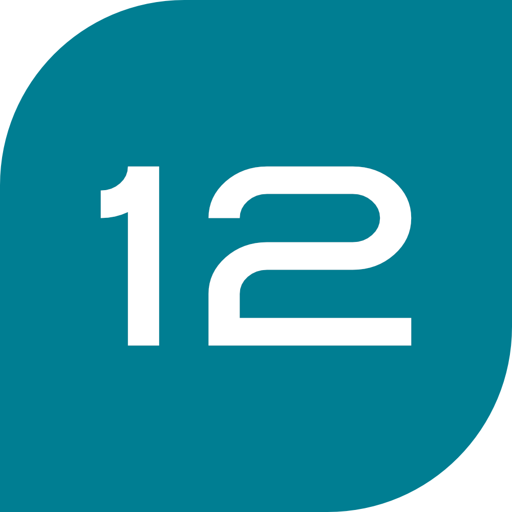
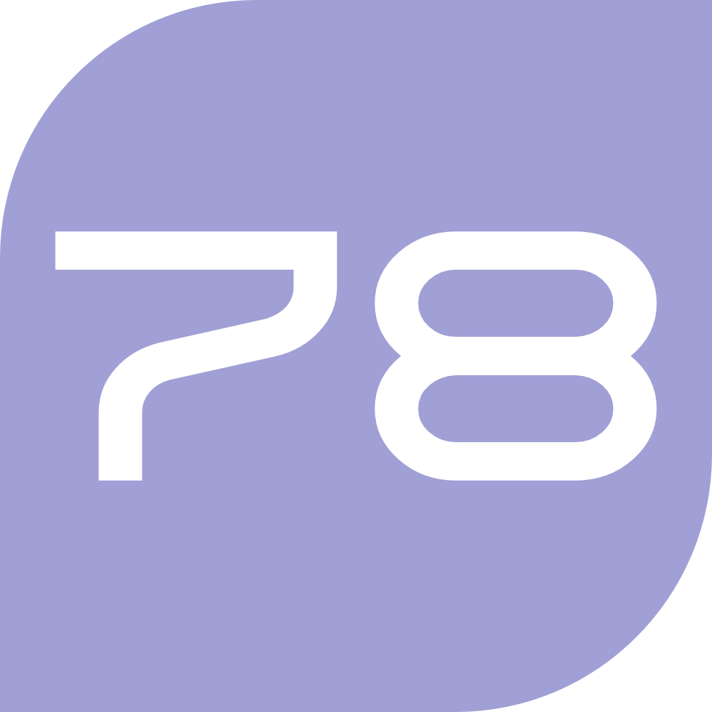
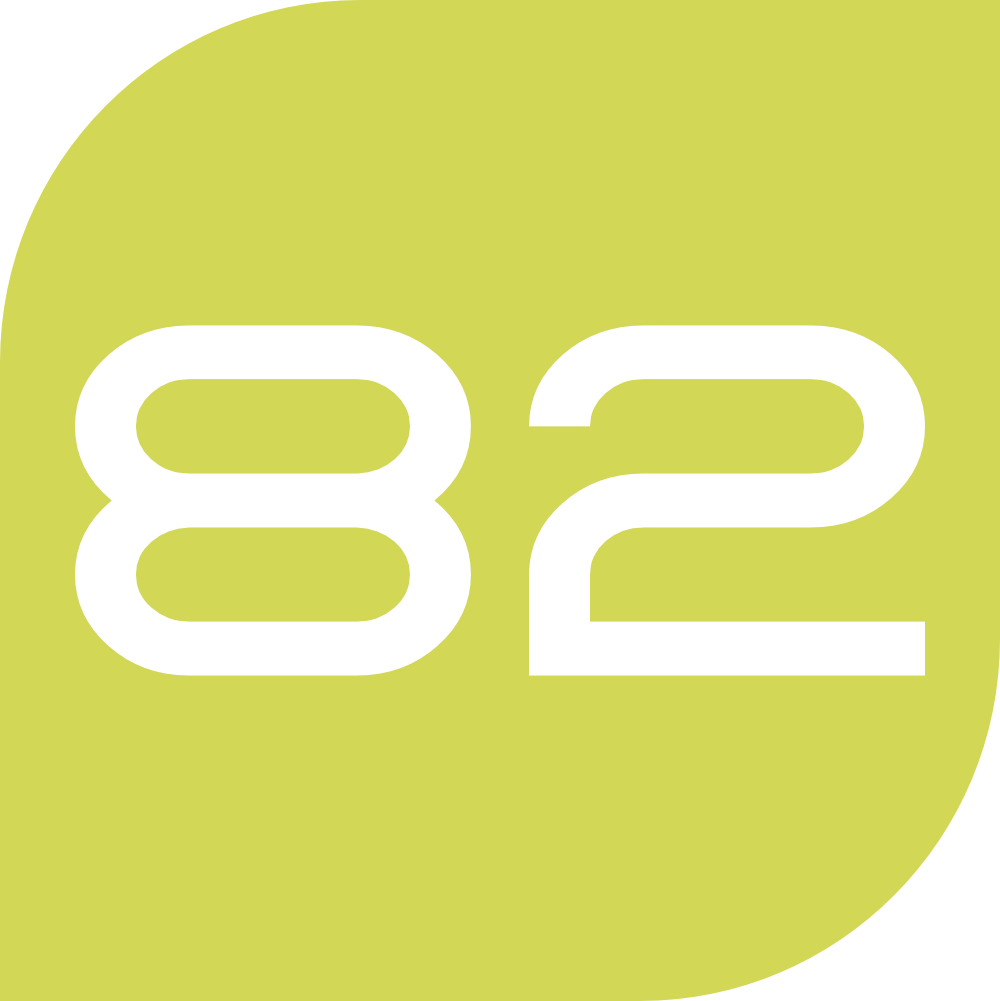
Tram lines
| Icon | Long Version |
|---|---|
 |
 |
 |
 |
 |
 |
 |
 |
 |
 |
 |
 |
 |
 |
 |
 |
 |
 |
 |
 |
 |
 |
 |
 |
 |
 |
 |
 |
 |
 |
 |
 |
 |
 |
 |
 |
 |
 |
 |
 |
 |
 |
 |
 |
 |
 |
 |
 |
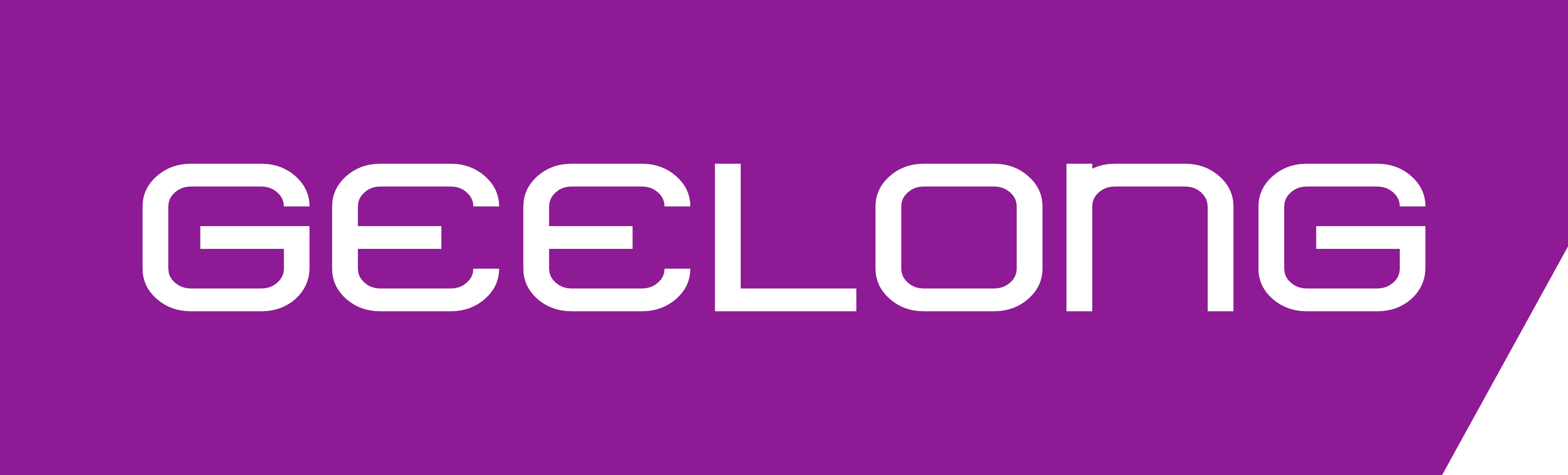
V/Line
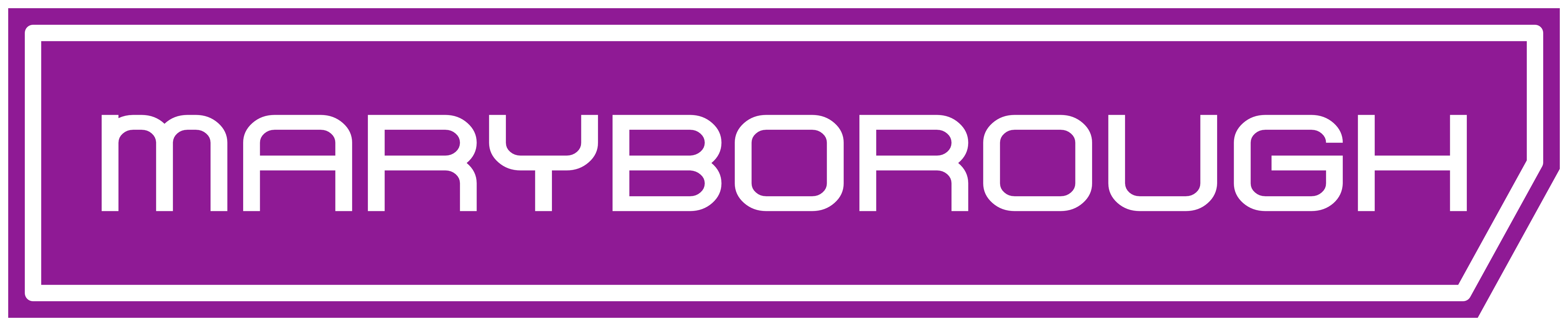
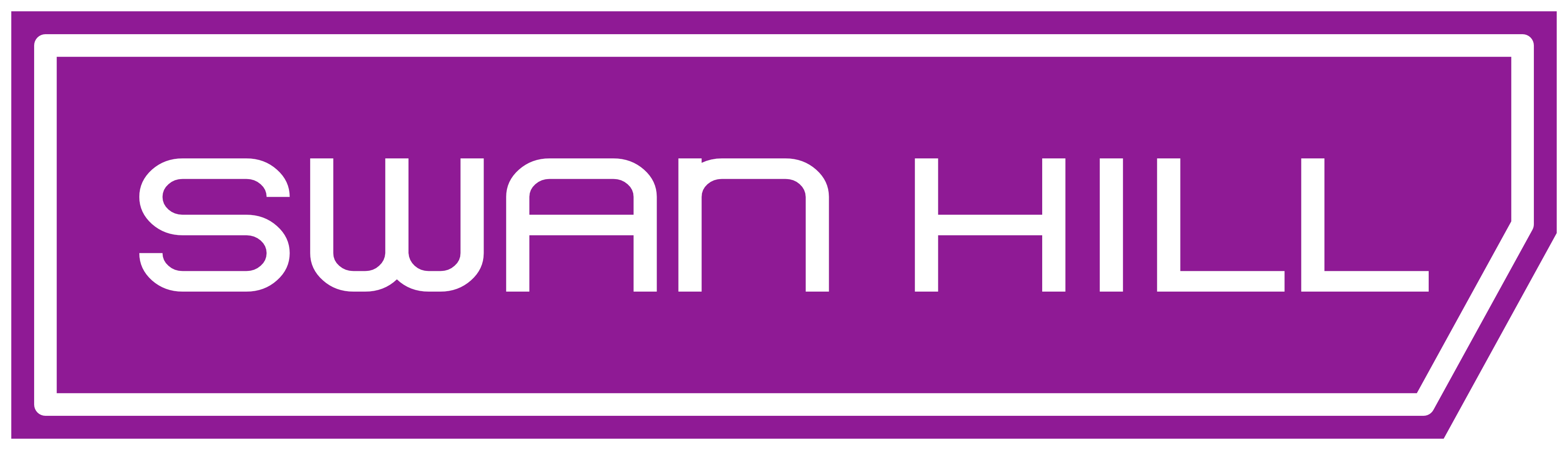
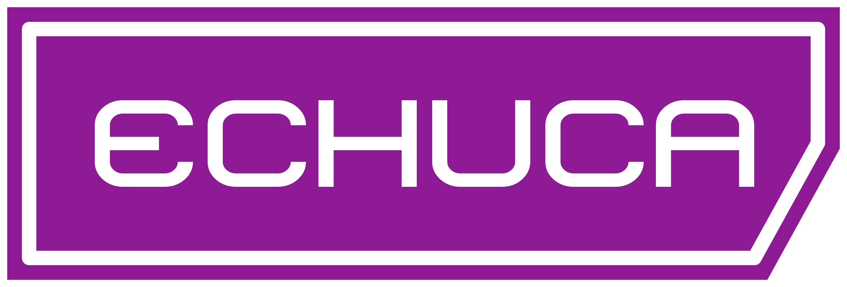
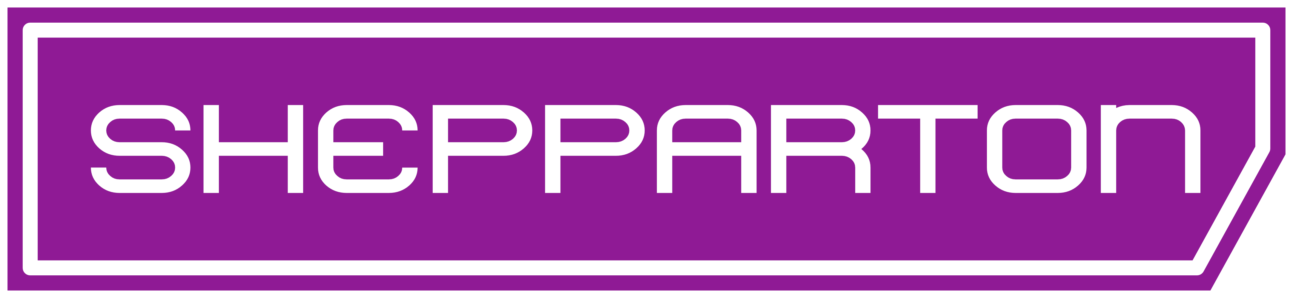
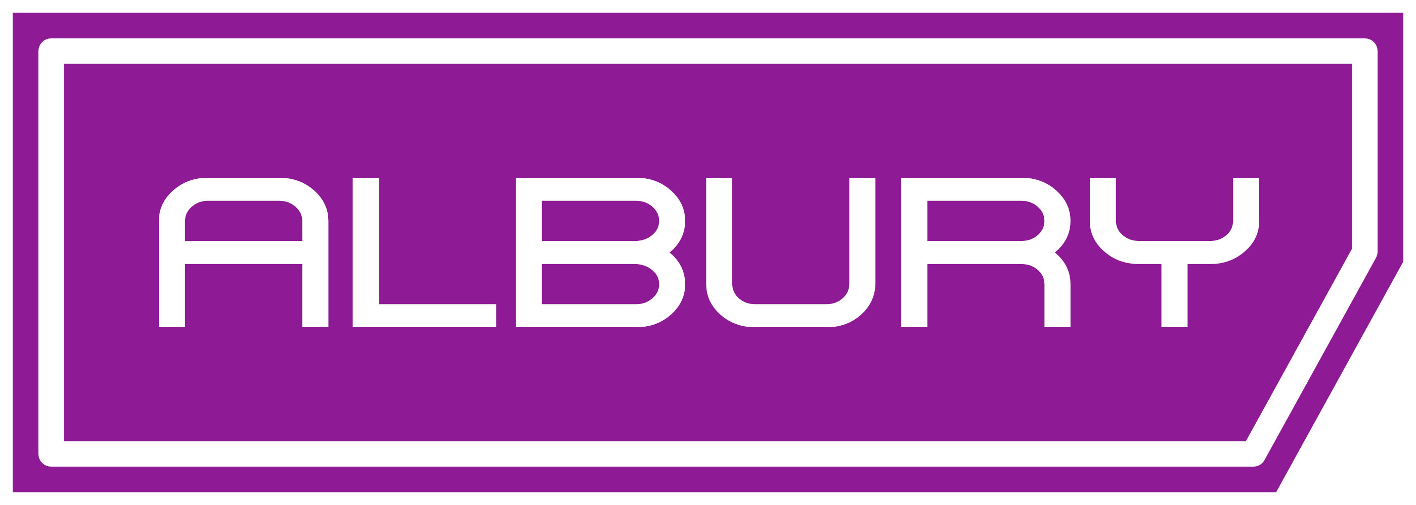
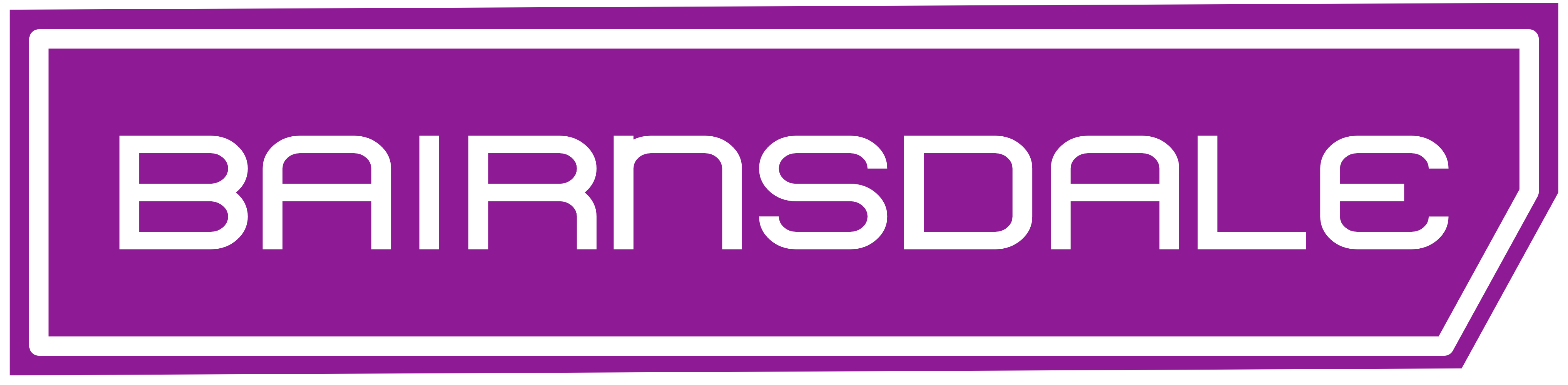
The icon for each line designation was made from a square with a diagonal cutout, to incorporate the “V” and the “/” parts of V/Line
Geelong Line
| Icon | Services |
|---|---|
 |
 |
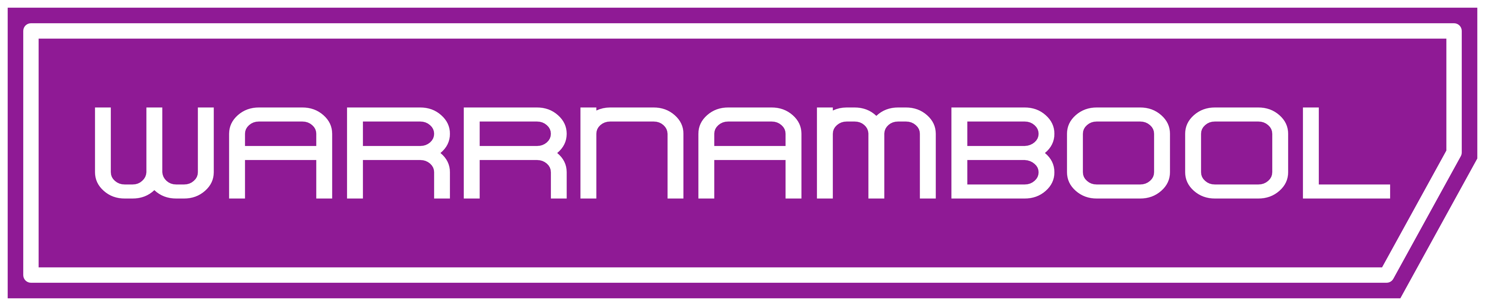 |
Ballarat Line
| Icon | Services |
|---|---|
 |
 |
 |
|
 |
Bendigo Line
| Icon | Services |
|---|---|
 |
 |
 |
|
 |
Seymour Line
| Icon | Services |
|---|---|
 |
 |
 |
|
 |
Traralgon Line
| Icon | Services |
|---|---|
 |
 |
 |
Other systems
Halfway through deciding each trains station pictogram, I realised that this was getting too big, and to design each bus, coach, and ferry line (Even if just in the style of Trams) would take too long. Maybe in the future I’ll retake this idea and make new signs for each of them. In the meantime, here’s each other service logo. Also, I was going to make mockup images for a handful of train stations with the brand identity I created, but alas, it was going to take too long.
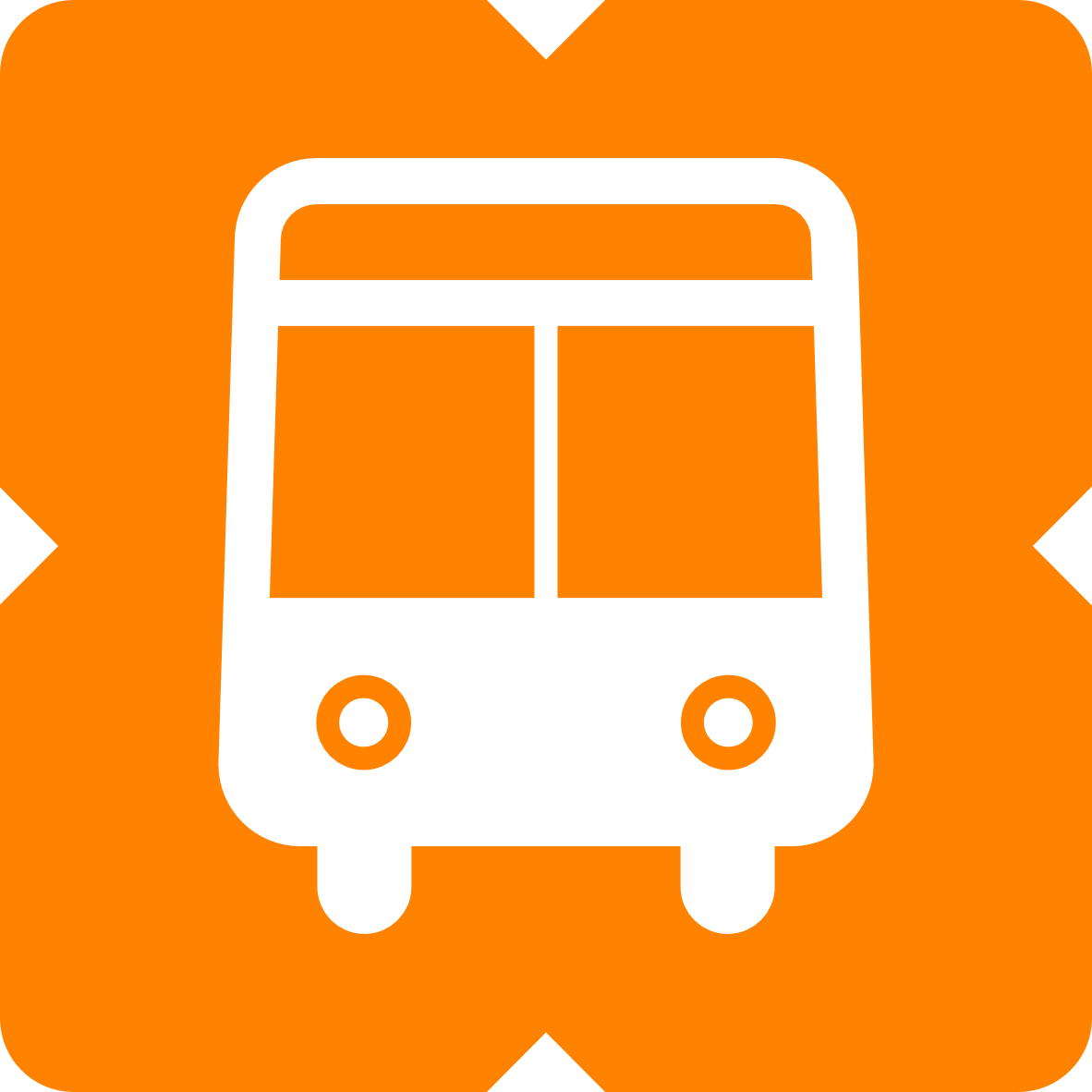
Buses
Skybus
![]()
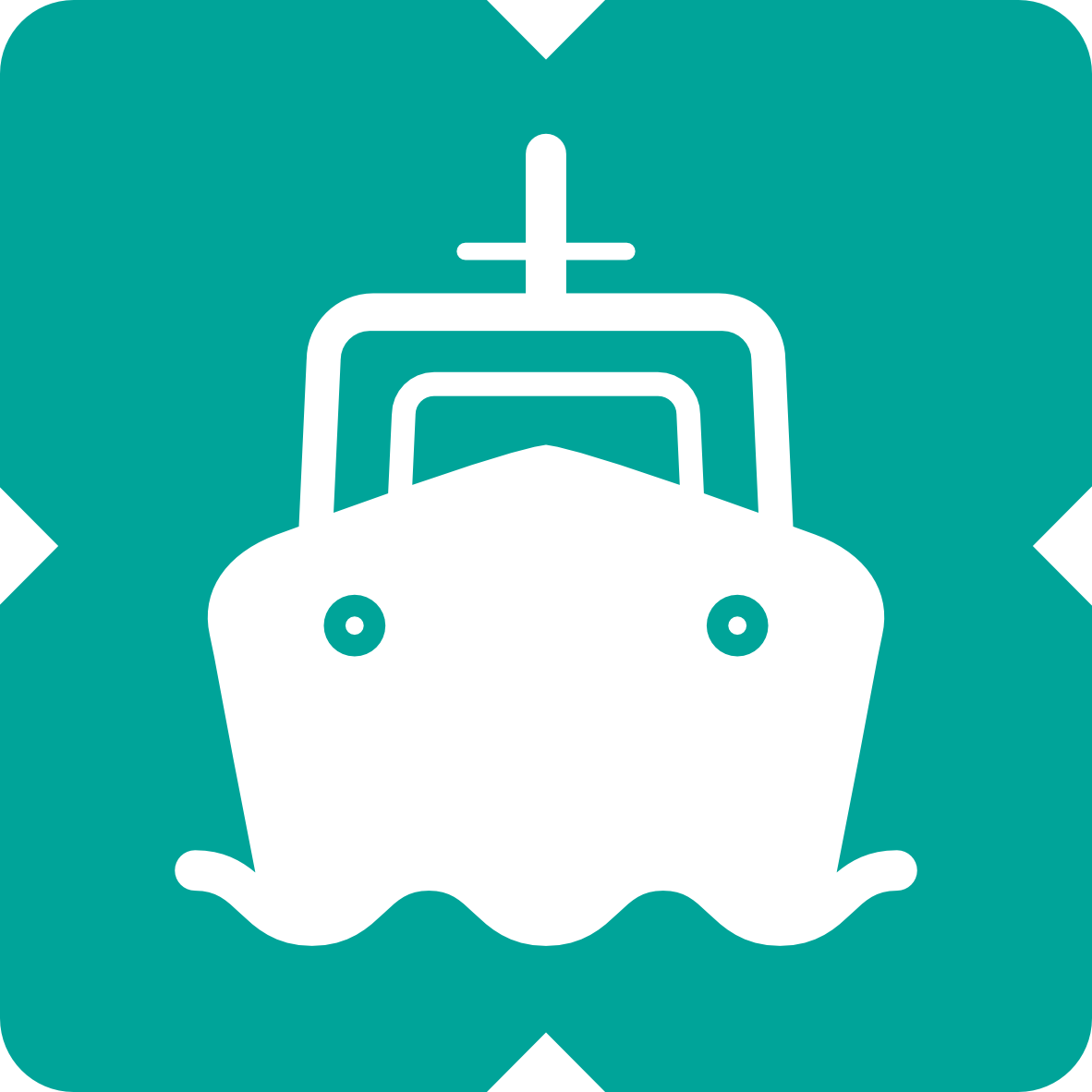
Ferries
V Line Coaches
Final Words
I learned a lot about public transport in Melbourne, each train station and suburb (that has a train station in it), graphic design, and wayfinding while doing this. I would do it again for another city’s transport systems… Sydney may be next?